$250 to $5K MRR: 5 App Store Packaging Rules That Actually Work ✍ Paul Solt🕐 2026-04-19📦 9.6 KB 🟢 已读 𝕏 文章列表 本文分享了如何通过优化应用商店包装,将 MRR 从 $250 提升至 $5,000。文章指出许多应用面临的不是流量问题,而是转化问题,并总结了五条核心规则:设计简洁醒目的图标、构建叙事风格的截图、展示成果而非教程的引导页、设置早期的付费墙以及简化用户操作流程。这些策略旨在提升点击率(CTR)和转化率。 iOS开发App StoreASO转化率优化产品设计独立开发变现策略付费墙UI设计增长黑客 # $250 to $5K MRR: 5 App Store Packaging Rules That Actually Work **作者**: Paul Solt **日期**: 2026-04-18T19:09:30.000Z **来源**: [https://x.com/PaulSolt/status/2045580498232373433](https://x.com/PaulSolt/status/2045580498232373433) --- 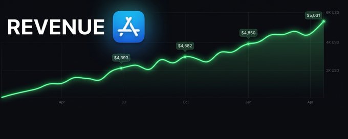 If your app is stuck between $10 - $300/month, you don't have a traffic problem. You have a packaging problem. You need to get users to stop scrolling and tap on your app. (Nothing else matters!) New App Developer? If you don't have an app, look at the top ranking App Store apps and mimic something that you would use. Simplify the design to 1-3 screens and ship it. Make a great product, and don't worry about revenue. ## From $250 to $5,000 MRR Viktor Seraleev (@seraleev) shared this moving story, which is what inspired this week's article (read the full tweet here): One of Viktor's followers had an old app that was making money, but it was stuck on a plateau. The monthly recurring revenue (MRR) was $250-$300/month for years on end. That developer started following @seraleev and made a few small changes: > A year ago he started following me. No drastic moves: just small, consistent changes. Organic traffic only. A few Reddit posts, some comments. The result? The MRR chart speaks for itself. 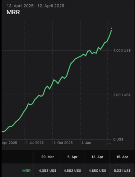 $5,031 Monthly Recurring Revenue (MRR) after improving the App Store packaging. If your app isn't selling, you don't have a traffic problem. You have a packaging problem. Try these 12 experiments from Viktor that you can run in the next 48 hours. Here are the top 5 rules Viktor uses on every app he launches. ## 1. Icon The icon is the first thing users see. If it doesn't earn the tap, nothing else gets a chance. It is important to have a simple design that conveys the idea of the app. It needs to feel polished and professional, or users will scroll past it. Customers make decisions in seconds. Look at his Video Templates & Audio Trends app for creating reels. Bold color. One clear subject. I needs to read clearly on the App Store search. It doesn't have to be a professionally designed icon, but it does need to stand out. If you're early to the App Store, don't get attached to your app icon design. Experimenting will get you more downloads. 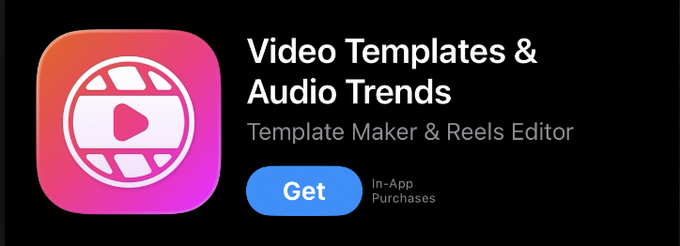 A video reels editor that helps with timing and shot composition. Here are more examples of app icons from Viktor: 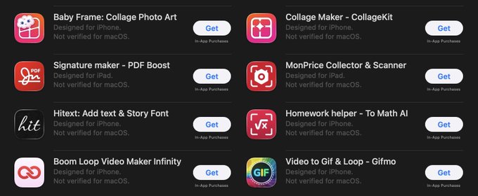 Viktor Seraleev's App Store icons are colorful and simple. ChatGPT can give you a starting app icon while you iterate. Use this style of prompt to explore app concepts (icon or app screens). Create a prompt for a prompt, and then generate variations to find your style: > Create a prompt for a mood board for an iOS app icon that creates photo collages. Create 9 icons in a grid to explore variations. Be creative, keep the design simple so it is readable at 60x60 points. Read the full prompt here. Here is the resulting icon mood board. 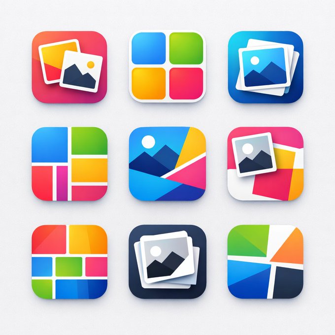 An icon mood board from ChatGPT. These are all great starting points that you can refine for composition. They aren't perfect, but they are very colorful and give you a sense of direction. Let's take a look at how Viktor's Baby Frame app stands out versus the competition. Here are the top 23 apps for the term: Baby Frame. 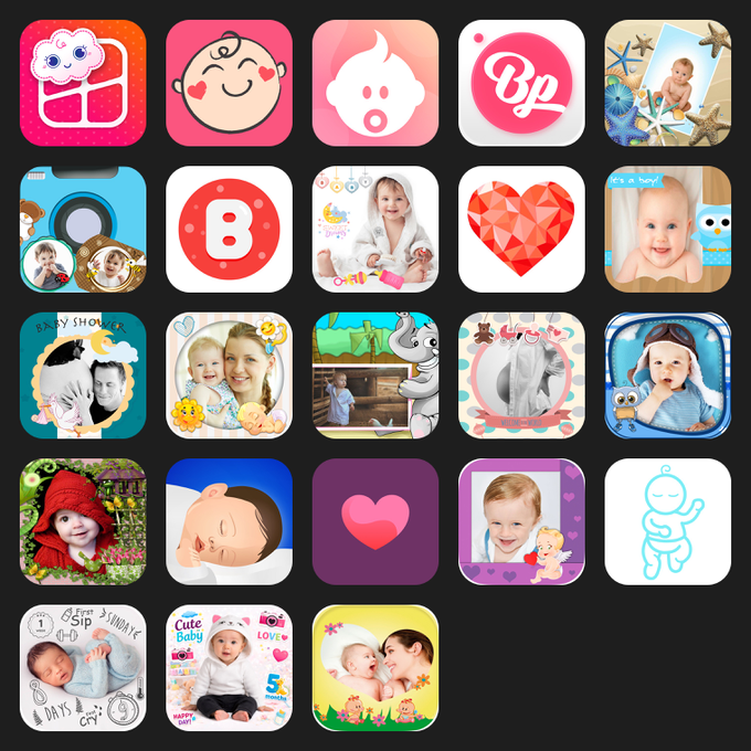 Baby Frame is number one and is the only image that conveys a photo collage. If you're stuck at 1% conversion, you need to start experimenting. Download 12 experiments you can run this weekend to make your app convert better. ## 2. Screenshots Stylize real screens from your app. Use large readable text and tell a story across the sequence. Take a look at this App Store search result with screenshots from Gifmo, one of Viktor's apps. It's a video to GIF generator: 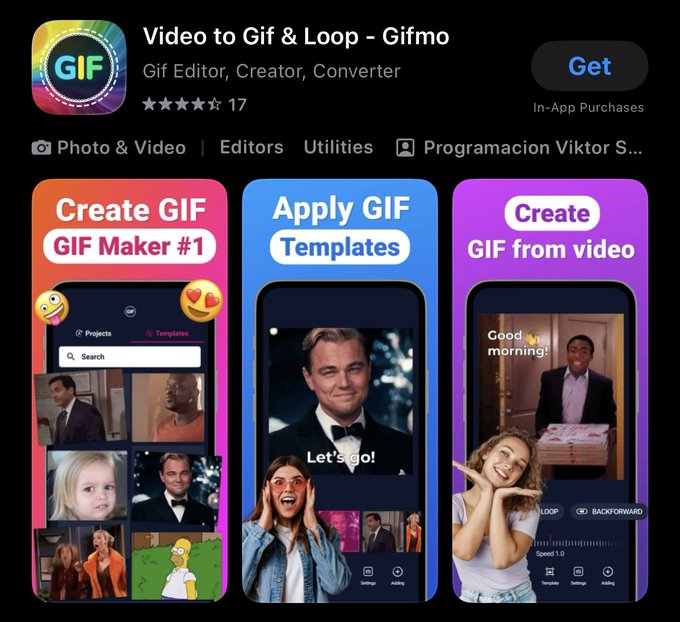 Colorful screens, real emotion, and supportive text that is easy to read. Gifmo's screenshots show a story: - First: Paint the picture with recognizable memes - Second: The template picker tool is teased - Third: The GIF video editor is shown You understand the app before you ever tap Get. It's not a tutorial of how to use the app. The first 3 screenshots are the most important because these are seen from the Search results on iOS (Look at the image above to see what customers see). Read my article featuring @designerants' best practices for App Store screenshots. ## 3. Onboarding Make your onboarding process 3–4 screens and show the outcome. Do not teach how to use the app. It should not be a tutorial. Use one action per step. Don't make the user work to understand what the app is. Reinforce the messaging from the App Store screens in your onboarding. Here is the onboarding from Gifmo: 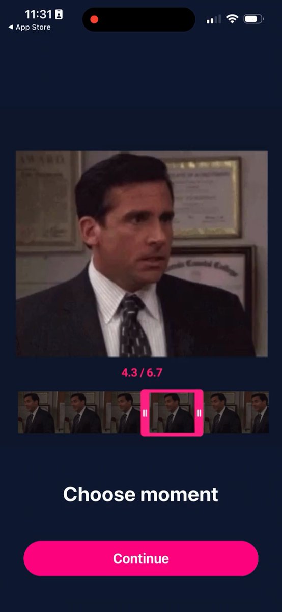 Onboarding screens show what the app can do using videos. The GOAL: Get the user to the "aha" moment as fast as possible. If they have to think or don't understand your app, you've lost them. They will close and delete your app. Use a "Continue" button or a swipe gesture to guide the user to the next screen. Videos in onboarding improve conversions over static images. Try it. ## 4. Paywall If you want to monetize the app, you need this step. 75% of Viktor's revenue comes from asking for money before using the app. If you've ever sold a paid app for $5, this is no different. - You've already been able to get a user to download your app. - Let's show there is value worth paying for in the first session. - Think of your onboarding screens as a free trial into what your app can do. If you can't do it now, you won't be able to do it later. > I once shipped a paywall that only 1% of users ever saw. > Do the math: 1 in 100 vs. ALL 100 customers. If only 1% of users see your paywall and you convert at 10%, you would need 1,000 people to download your app to get one paying customer. That's HARD! Here is the Gifmo paywall: 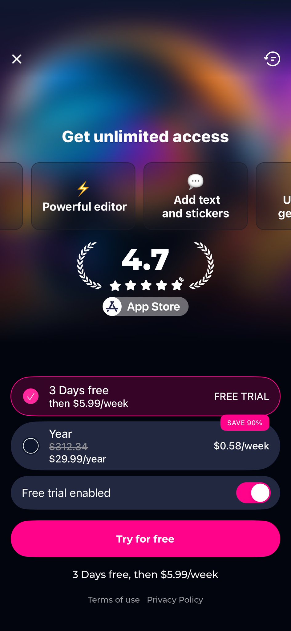 Gifmo's paywall. Viktor puts the paywall right after the value moment. No hidden close button. No fake urgency. No price tricks. Clear offer and clear value. The App Store keeps changing rules, and you may not be able to do the "Free trial" toggle shown above. But you can leverage some of the tactics here: - Experiment with a 3-day, 7-day, or 30-day free trial - Weekly pricing: $5.99 - $7.99/week - Annual pricing: $29.99 - $59.99/year - Skip lifetime deals to drive recurring revenue We're not making an app you would pay for; we're making an app that solves a problem the user is searching for. If you price it based on your preferences, you will leave money on the table. Let's break down the paywall above: - Annual pricing highlights the 90% discount ($312.34 vs $29.99) - Weekly math is calculated: $5.99/week vs. $0.58/week - App Store rating is shown for trust and social proof These are all known sales tactics that work. If you want to sell something you need to use comparison, multiple offers, and easy numbers. Don't make a user think twice about your pricing. If they do, you've already lost the sale. > If you want the exact experiments to run this weekend (icon tests, screenshot swaps, paywall placement), grab the 12-experiments here. ## 5. Simple User Flow One screen. One action. Create a clear path forward. Every extra tap is a chance to lose the user. Every decision they have to make is a chance for them to bounce. Remove anything that makes them stop and think. This is why Viktor's apps feel obvious. He's already cut the clutter. 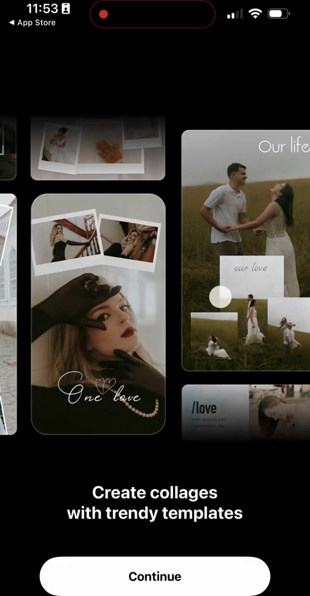 CollageKit shows vivid images and highlights the final outcome. ## Focus on these 5 Key Points: Icon: bold, clear, readable at thumbnail size Screenshots: story sequence, value in position one Onboarding: 3 to 4 screens or videos, paint the outcome Paywall: right after onboarding, simple math Flow: one screen, one action, clear path If you want to monetize your app, find the value, tell a story, and improve your packaging. Which of the five are you getting wrong right now? Reply below. Building iOS/macOS apps with AI tools? Follow @PaulSolt for the workflows I'm actually using. P.S. Want to dig deeper? Read this post from Viktor and watch the video that @adamlyttleapps created about this app strategy. P.P.S. Download 12 experiments you can run this weekend — inspired by Viktor Seraleev. ## 相关链接 - [Paul Solt](https://x.com/PaulSolt) - [@PaulSolt](https://x.com/PaulSolt) - [40K](https://x.com/PaulSolt/status/2045580498232373433/analytics) - [@seraleev](https://x.com/@seraleev) - [full tweet here](https://x.com/seraleev/status/2044408846735507902?s=20) - [@seraleev](https://x.com/@seraleev) - [@designerants](https://x.com/@designerants) - [@PaulSolt](https://x.com/@PaulSolt) - [post from Viktor](https://x.com/seraleev/status/2010023256984879170?s=20) - [@adamlyttleapps](https://x.com/@adamlyttleapps) - [Upgrade to Premium](https://x.com/i/premium_sign_up) - [3:09 AM · Apr 19, 2026](https://x.com/PaulSolt/status/2045580498232373433) - [40K Views](https://x.com/PaulSolt/status/2045580498232373433/analytics) - [View quotes](https://x.com/PaulSolt/status/2045580498232373433/quotes) --- *导出时间: 2026/4/19 21:48:23*
如 如何让你的 App 质感提升 10 倍(速查表) 文章分享了提升应用质感的 9 个关键技巧:优化引导流程、添加有意义的动效、精心设计空状态、增加触觉反馈、统一图标风格、提升响应速度、使用人性化文案、研究优秀应用案例,以及寻求专业设计团队支持。强调通过细节打磨而非单纯增加功能来改善用户体验。 技术 › 前端 ✍ Satya🕐 2026-07-19 UI设计用户体验移动端动效产品设计
2 2026年7月最值得关注的AI科技/编程产品/创业出海/赚钱副业的100位博主 文章经过与四大主流模型讨论,筛选出100位在AI、编程、创业出海、副业赚钱等领域的优质博主。标准包括专业实战、粉丝过万及高活跃度。推荐关注这些高价值账号以获取行业前沿动态。 技术 › 工具与效率 ✍ 启航🕐 2026-07-16 AI编程创业出海副业博主推荐技术栈产品设计独立开发AI视频
记 记录一次 Reddit 广告投放:$40 预算与 0 转化的复盘 本文记录了一次针对 AI 道歉/信件生成工具的 Reddit 广告投放实战。在花费约 $42 并获得精准流量后,最终转化率为 0。文章详细复盘了从开户、选品、素材设计到数据追踪的全过程,得出了“社区人群匹配不代表付费意愿匹配”的关键结论,并指出了情绪型内容与工具型产品之间的转化鸿沟。 技术 › 独立开发 ✍ droidHZ🕐 2026-07-10 独立开发广告投放增长黑客Reddit复盘转化率创业MarketingAI产品冷启动
别 别再让 AI 硬写网页了!这 5 个设计 Skills 让页面质感直接升级 文章指出使用 AI 直接编写网页往往导致设计模板化、缺乏质感,并介绍了 5 个用于提升网页设计水平的 Skills(taste-design, web-design, emilkowalski, magicslide, Design MD Collection)。文章提供了一个完整的工作流:从确定设计规范和参考,到生成代码及 UI 抛光,帮助独立开发者消除“AI 味”,打造高保真的产品页面。 技术 › Skill ✍ 云析🕐 2026-07-06 AI编程网页设计UI设计Claude CodeCodex工作流设计规范独立开发Landing Page
t tw93 的开源故事:十三年六款工具的长期主义 本文专访了前端工程师 tw93,讲述他在 13 年间利用业余时间开发了 6 款知名开源工具(如 Pake、Mole)的故事。文章深入探讨了他的产品逻辑(解决自身痛点)、设计审美、长期主义价值观,以及在 AI 时代构建个人技术壁垒的独特见解,并分享了个人开发者出海商业化的实战经验。 技术 › 工具与效率 ✍ 向阳乔木🕐 2026-05-24 开源个人开发长期主义AI产品设计独立开发访谈ClaudeWazaPake
C Claude Code for Solo Founders: From Idea to First Paying 本文是面向独立创始人的 Claude Code 使用指南。文章提出在 2026 年,独立创始人的核心竞争力不再是写代码,而是判断力与方向把控。通过利用 Claude Code 作为执行者,创始人可将角色从专家转变为导演,大幅缩短从想法验证到获得首个付费用户的时间(仅需 30-60 天)。文中详细介绍了如何利用 AI 进行想法验证、落地页测试和客户访谈,并提供了在周末构建 MVP 的具体提示词(Prompt)和开发排期,强调了 CLAUDE.md 文档在控制项目范围中的关键作用。 技术 › Claude Code ✍ CyrilXBT🕐 2026-05-12 独立开发创业MVPAI编程方法论提示词产品设计独立黑客效率验证
我 我在 Gridea 思考箱里记的笔记,变成了 Minttr 文章分享了作者从开发博客客户端 Gridea 中的“思考箱”功能,到孵化出新产品 Minttr 的全过程。作者通过记录零散想法,逐渐明确了产品的核心价值——降低记录门槛,让好奇心有落脚之地。文章探讨了笔记记录如何引导产品方向,以及工具制造者重度使用自身工具的重要性。 技术 › 工具与效率 ✍ Zayn Hao🕐 2026-05-06 独立开发产品设计GrideaMinttr知识管理笔记工具随笔心路历程
独 独立开发者如何靠 ASO 月入 10 万美元 本文分享了独立开发者 Sebastian 通过 ASO(应用商店优化)技术,使习惯追踪 App HabitKit 月收入从 1.5 万美金增长至 10 万美金的成功案例。文章详细拆解了其核心获客策略:不依赖广告投放,而是通过优化 App 名称(关键词前置)、副标题、后台关键词字段以及提升搜索排名来获取自然流量。同时,强调了截图设计、评分积累的时机把握及用户评论回复等运营细节。 技术 › 工具与效率 ✍ 出海去孵化器🕐 2026-05-06 ASO独立开发App增长移动端HabitKit关键词优化产品运营转化率出海案例分析
H How to Build An Entire iOS App With Claude Code in 48 Hours 作者分享了使用 Claude Code 在 48 小时内构建高质量 iOS 应用的完整流程。文章指出,大多数 AI 生成的应用因缺乏设计而显得平庸。作者的秘诀在于:利用 Sensor Tower 寻找已验证的赚钱点子;通过 Pinterest 寻找设计灵感;使用 GPT 2.0 生成吉祥物素材;借助 Seedance 2.0 制作动画;最后利用 Claude Design 进行 UI 设计并交由 Claude Code 编写代码。文章强调“氛围感”是应用脱颖而出的关键,并详细介绍了如何结合 Claude Design 与 Claude Code 实现从设计到部署的自动化开发。 技术 › Claude Code ✍ ashen🕐 2026-05-02 iOS开发Claude CodeUI设计开发流程AIGC移动应用
1 16个粉丝到月入400万:他自信地用套壳产品名利双收 文章讲述了一名大学生 Yasser 如何利用技术进化的时间差和 Reddit 引流策略,将一个简单的套壳产品 Chatbase(文档上传生成 ChatGPT)做到 680 万美金年营收的故事。核心策略包括提前布局、认知借势、SEO 增量以及循环上线的分发机制,为独立开发者提供了极具参考价值的变现路径。 技术 › AI ✍ GoSail Lab🕐 2026-04-28 AI创业独立开发变现ChatGPT套壳增长黑客SEO产品方法论出海Reddit引流
如 如何利用 AI 每月高效开发并上线 2 款移动应用 文章详细介绍了作者利用 AI 工具(如 Rork Max 和 Perplexity Computer)每月构建并发布 2 款移动应用的完整系统。作者认为 B2C 移动应用在 2026 年是被低估的机会,相比 SaaS 更不易被巨头通过功能更新摧毁。其工作流包括利用 AI 进行市场调研、锁定设计系统以避免视觉割裂、制定 UI 开发计划确保通过审核,以及通过任务拆分构建后端,实现了低成本、低风险的快速产品迭代与验证。 技术 › 移动端 ✍ Prajwal Tomar🕐 2026-04-24 AI开发Rork Max移动应用独立开发产品设计工作流TikTok营销创业低代码Perplexity
T Top YC 公司着陆页的通用结构解析 文章分析了 5 家顶尖 YC 孵化公司(如 Resend, Deel 等)的着陆页设计,发现其结构惊人一致。核心模式包括:一行式标题配产品截图、首屏展示社会认同、单一的重复性 CTA、展示创始人照片以建立信任、公开透明的定价信息、精选 3-6 个核心功能,以及以行动号召结尾。这种结构符合用户“是什么-谁在用-怎么用-多少钱”的决策心理,能有效提升转化率。 技术 › 前端 ✍ clear🕐 2026-04-22 产品设计用户体验转化率着陆页创业SaaSUI/UX增长黑客前端开发营销