# How to Make Your App Look & Feel 10x Better (Copy these Cheatsheet)
**作者**: Satya
**日期**: 2026-07-18T06:51:11.000Z
**来源**: [https://x.com/heysatya_/status/2078444307418345639](https://x.com/heysatya_/status/2078444307418345639)
---
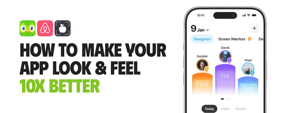
We’ve designed hundreds of apps, including products for some of the biggest names on Twitter.
And one thing I’ve learned is that your app doesn’t need more features to feel 10x better.
It needs more care in the moments between those features.
Here’s how:
> 1. Make your onboarding better
Make it intuitive, simple, and even a little fun.
Guide users clearly without overwhelming them. Show value quickly, use friendly language, and remove friction wherever possible.
A great first experience sets the tone for everything that follows.
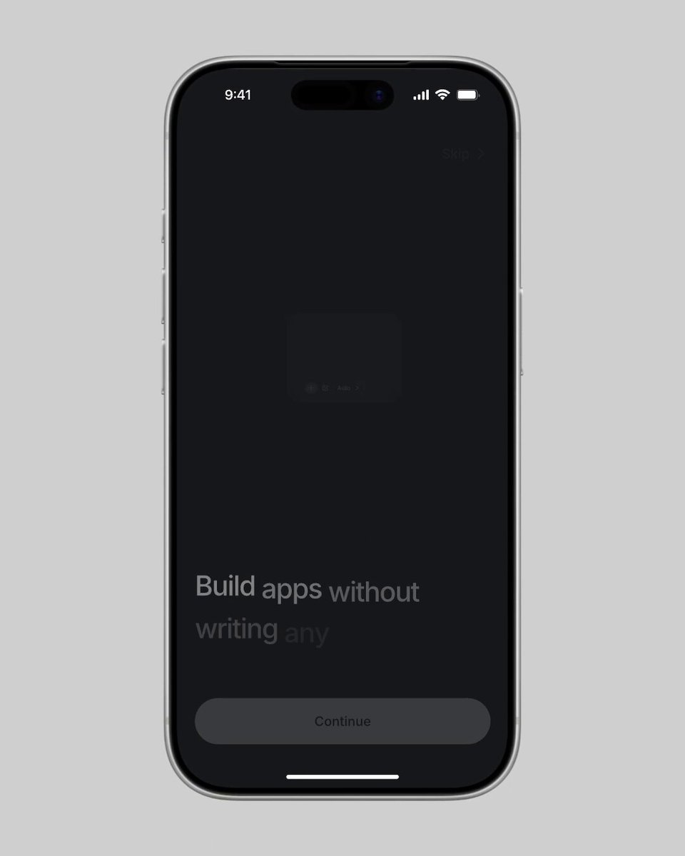
Anything iOS App - Designed by our team (Kree8.studio)
> 2. Add motion with purpose
Buttons should react. Screens should transition naturally. Actions should feel connected.
Don’t animate everything - animate the moments that help users understand what just happened.

Budget App - Designed by our team (Kree8.studio)
> 3. Never leave empty states empty
“No data found” adds nothing.
Use illustrations, personality, helpful copy, and one clear action to guide the user forward.
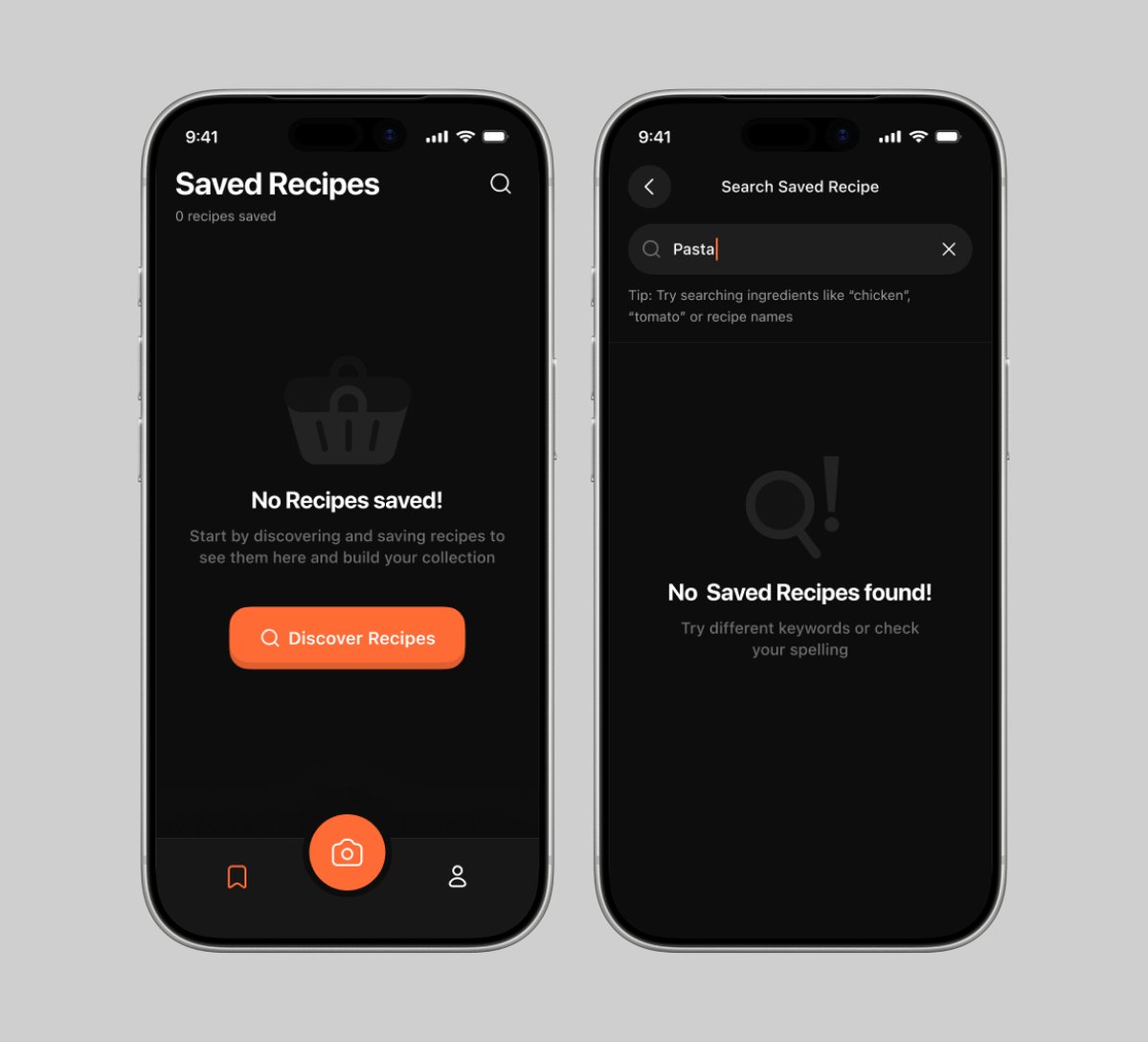
AI Meal Tracker App - Designed by our team (Kree8.studio)
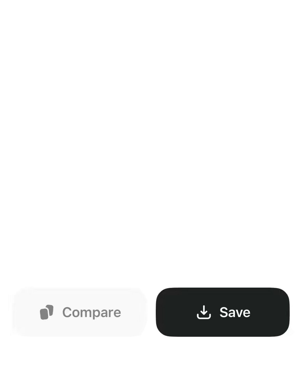
> 4. Make interactions feel physical
Use subtle haptics for regular taps and stronger feedback for confirmations, completed tasks, and milestones.
Every action should feel acknowledged.
> **Satya@heysatya_**: [原文链接](https://x.com/heysatya_/status/2078371988746445251)
>
> hold to delete
>
> 
> 5. Treat icons like typography
Choose one icon family and stay consistent with its weight, stroke, and style.
Use filled or heavier icons for selected states instead of relying only on color.
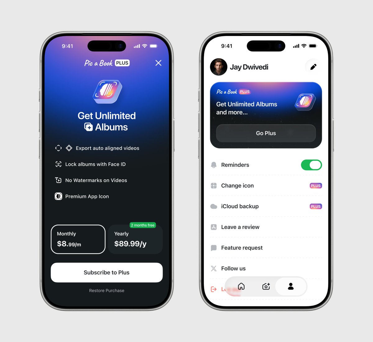
Pick a Book App - Designed by our team (Kree8.studio)
> 6. Make the app feel faster
Show instant feedback after every tap.
Use skeleton loaders, optimistic updates, and smooth transitions so users never wonder whether the app is working.
> 7. Write like a human
“You’re all caught up” feels better than “No results available.”
Good product copy is part of the experience - not something added at the end.
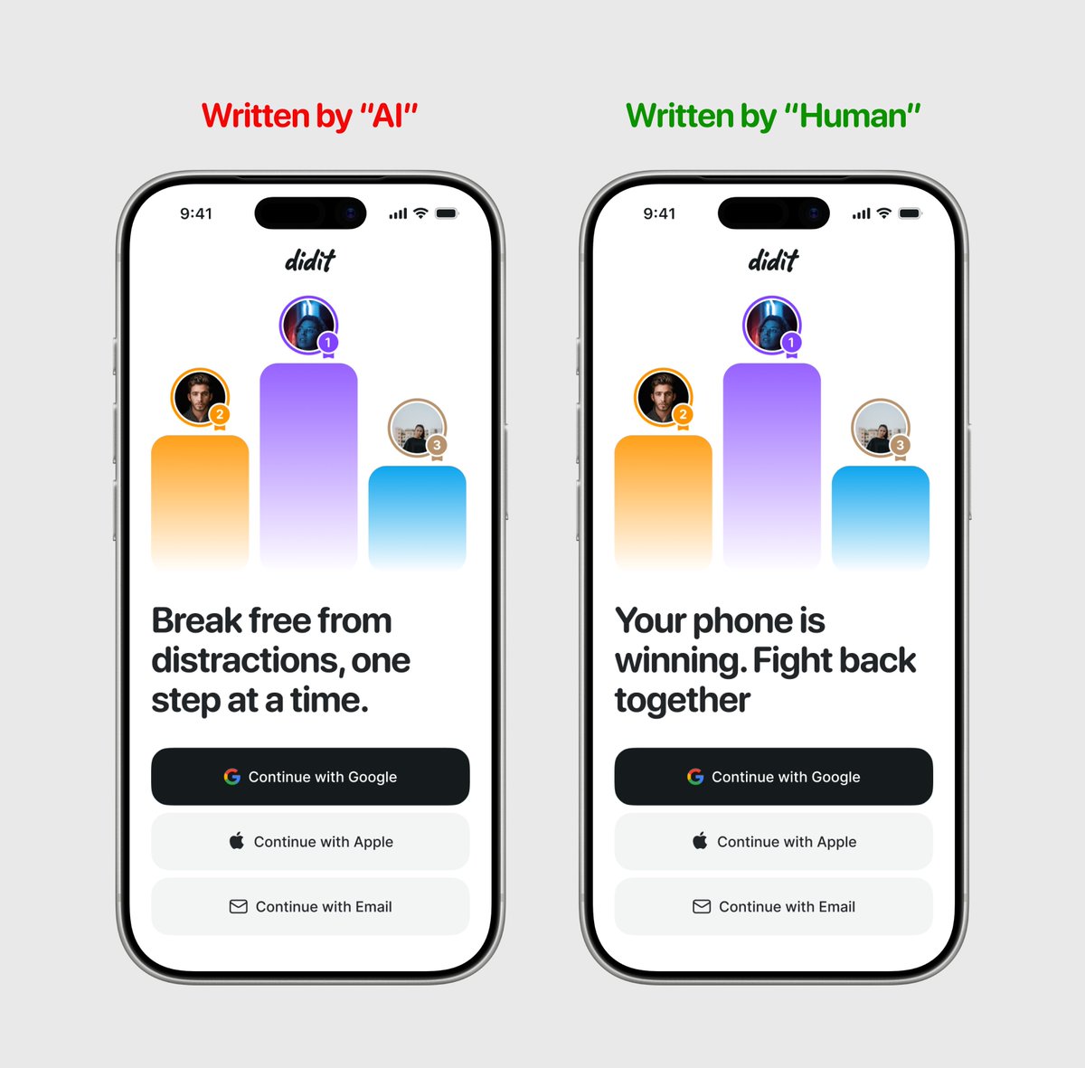
Screentime Saver App - Designed by our team (Kree8.studio)
> 8. Study great apps constantly
Don’t just copy beautiful screens.
Understand why the spacing works, why an animation feels satisfying, and why certain interactions feel obvious.
A premium app isn’t created by one impressive screen.
It’s created through hundreds of tiny decisions users may never consciously notice, but will always feel.
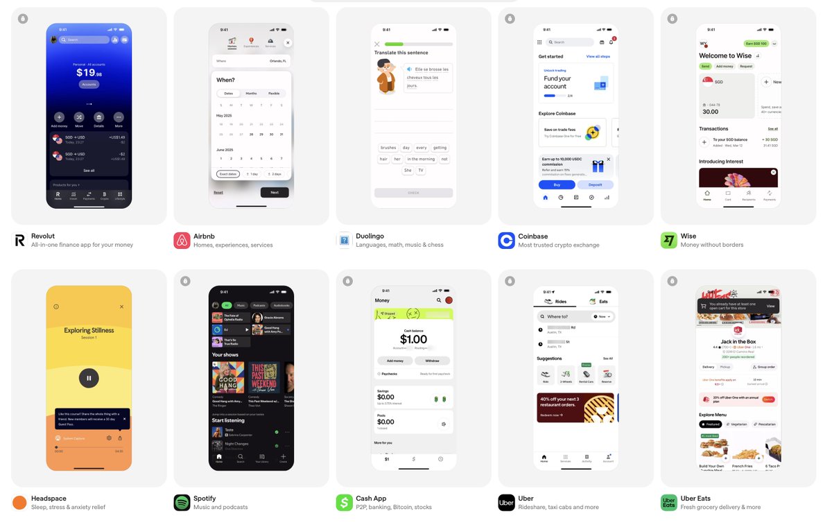
Screenshot from Mobbin
> 9. Or just hire Kree8 Studio :)
We’ll handle all these tiny details and make your app feel 10x better. Book a call now -> kree8.studio

## 相关链接
- [Satya](https://x.com/heysatya_)
- [@heysatya_](https://x.com/heysatya_)
- [128K](https://x.com/heysatya_/status/2078444307418345639/analytics)
- [Kree8.studio](https://kree8.studio/)
- [Kree8.studio](https://kree8.studio/)
- [Kree8.studio](https://kree8.studio/)
- [Jul 18](https://x.com/heysatya_/status/2078371988746445251)
- [11K](https://x.com/heysatya_/status/2078371988746445251/analytics)
- [Kree8.studio](https://kree8.studio/)
- [Kree8.studio](https://kree8.studio/)
- [kree8.studio](https://kree8.studio/)
- [Upgrade to Premium](https://x.com/i/premium_sign_up)
- [7:38 PM · Jul 18, 2026](https://x.com/heysatya_/status/2078444307418345639)
- [128.6K Views](https://x.com/heysatya_/status/2078444307418345639/analytics)
- [View quotes](https://x.com/heysatya_/status/2078444307418345639/quotes)
---
*导出时间: 2026/7/19 16:30:59*
---
## 中文翻译
# 如何让你的 App 质感提升 10 倍(照抄这份速查表)
**作者**: Satya
**日期**: 2026-07-18T06:51:11.000Z
**来源**: [https://x.com/heysatya_/status/2078444307418345639](https://x.com/heysatya_/status/2078444307418345639)
---

我们设计过数百款应用,包括为 Twitter 上一些知名人士打造的产品。
我学到的一点是,你的 App 并不需要更多功能来让体验提升 10 倍。
它需要的是在功能之间的那些时刻投入更多用心。
方法如下:
> 1. 优化引导流程(Onboarding)
让它直观、简单,甚至带点趣味。
清晰地引导用户,但不要让他们感到不知所措。快速展示产品价值,使用友好的语言,并尽可能消除阻力。
出色的初次体验为后续的一切定下了基调。

Anything iOS App - 由我们的团队设计(Kree8.studio)
> 2. 赋予动作以目的性
按钮应该有反应。界面应该自然过渡。操作应该让人觉得是连贯的。
不要给所有东西都做动画——只对那些能帮助用户理解刚刚发生了什么的时刻做动画。

Budget App - 由我们的团队设计(Kree8.studio)
> 3. 永远不要让空状态(Empty States)真的“空”着
“未找到数据”毫无意义。
使用插图、个性化元素、有帮助的文案和一个明确的行动点来引导用户继续操作。

AI Meal Tracker App - 由我们的团队设计(Kree8.studio)
> 4. 让交互具有实体感
普通点击使用微妙的触感反馈,而确认操作、完成任务和里程碑时刻使用更强的反馈。
每一次操作都应该让人觉得被“确认”了。
> **Satya@heysatya_**: [原文链接](https://x.com/heysatya_/status/2078371988746445251)
>
> 长按删除
>
> 
> 5. 像对待排版一样对待图标
选择一套图标家族,并在字重、线条和风格上保持一致。
对于选中状态,使用填充或更粗的图标,而不仅仅依赖颜色。

Pick a Book App - 由我们的团队设计(Kree8.studio)
> 6. 让 App 感觉更快
每次点击后都给出即时反馈。
使用骨架屏、乐观更新(Optimistic Updates)和流畅的过渡效果,让用户永远不会怀疑 App 是否正在运行。
> 7. 像真人一样写文案
“你已经看完了”比“无可用结果”感觉更好。
好的产品文案是体验的一部分——而不是最后才加上去的东西。

Screentime Saver App - 由我们的团队设计(Kree8.studio)
> 8. 持续研究优秀的应用
不要只是复制漂亮的界面。
要理解为什么间距有效,为什么动画让人感觉满足,以及为什么某些交互显得显而易见。
一款顶级的 App 不是靠一个令人印象深刻的界面创造出来的。
它是通过数百个用户可能永远不会有意识地注意到、但永远能感觉到的微小决策创造出来的。

Screenshot from Mobbin
> 9. 或者直接雇佣 Kree8 Studio :)
我们会处理所有这些微小的细节,让你的 App 质感提升 10 倍。立即预订通话 -> kree8.studio

## 相关链接
- [Satya](https://x.com/heysatya_)
- [@heysatya_](https://x.com/heysatya_)
- [128K](https://x.com/heysatya_/status/2078444307418345639/analytics)
- [Kree8.studio](https://kree8.studio/)
- [Kree8.studio](https://kree8.studio/)
- [Kree8.studio](https://kree8.studio/)
- [Jul 18](https://x.com/heysatya_/status/2078371988746445251)
- [11K](https://x.com/heysatya_/status/2078371988746445251/analytics)
- [Kree8.studio](https://kree8.studio/)
- [Kree8.studio](https://kree8.studio/)
- [kree8.studio](https://kree8.studio/)
- [Upgrade to Premium](https://x.com/i/premium_sign_up)
- [7:38 PM · Jul 18, 2026](https://x.com/heysatya_/status/2078444307418345639)
- [128.6K Views](https://x.com/heysatya_/status/2078444307418345639/analytics)
- [View quotes](https://x.com/heysatya_/status/2078444307418345639/quotes)
---
*导出时间: 2026/7/19 16:30:59*