# Building Better Frontends with an Image-to-Code approach
**作者**: Leon Lin
**日期**: 2026-04-27T15:49:15.000Z
**来源**: [https://x.com/LexnLin/status/2048791596137632126](https://x.com/LexnLin/status/2048791596137632126)
---
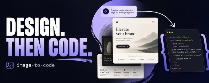
Most AI-generated websites still look average or sloppy.
Not because the models are useless, but because the workflow is usually wrong. People ask a coding agent to “make it modern,” “make it clean,” or “make it premium” and then expect great taste to appear right away.
Sometimes that works. Most of the time, you get the same AI landing page again: centered hero, gradient blob, random cards, weak spacing.
The better approach: separate the visual design step from the coding step.
-> Instead of asking an agent to invent and code the entire website at once, generate high-quality website images first.
-> Then turn those images into code section by section.
That is the image-to-code frontend workflow.
## What image-to-code means
Image-to-code means you start with visual references instead of code.
The workflow looks something like this:
1. Generate images of the website or app screens you want
2. Pick the best visual direction
3. Extract or recreate the assets from those images
4. Give the images and assets to a coding agent
5. Build the frontend section by section
6. Refine with screenshots until it matches the design
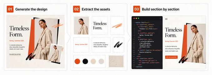
Instead of asking the model to invent taste, layout, assets, responsiveness, and implementation at once, you give it a visual target.
## Why this works better than prompting code directly
Frontend quality is visual before it is technical.
A good website depends on spacing, hierarchy, composition, typography, color, assets, and small decisions.
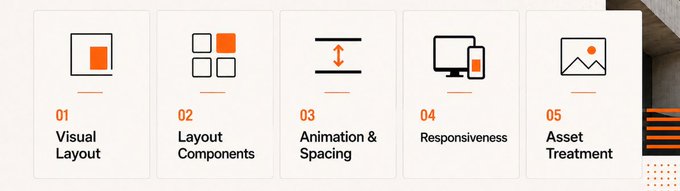
Now Image generation is different. You can describe the look in plain words and the model can focus almost entirely on visual output. In my experience, it is much easier to tune an image skill for taste than a coding skill.
A coding skill needs to care about implementation, structure, edge cases, performance, accessibility, responsiveness, naming, and visual polish. An image skill can be much more direct:
> This is the kind of layout. This is the type of composition. This is the level of minimalism. This is the brand feeling. Do not make it generic.
## Why Images 2.0 is currently the best choice
Right now, my preferred model is ChatGPT Images 2.0. It is especially strong for website-images because it understands layout, hierarchy, interface structure, typography and visual systems better than most image models I have tried. (nb, grok imagine,...)
And you can use reference images to get the exact style you need.
Some tips:
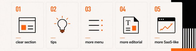
A good frontend reference image needs:
- clear section structure
- readable hierarchy
- usable interface patterns
- realistic spacing
- strong art direction
- assets that make sense and match the theme
- enough details for an ai agent to copy
You can use it inside ChatGPT. If your coding environment supports image generation, you can also generate it there, but I personally prefer the ChatGPT interface for exploration because it is simple, fast to iterate and easier to control.
## Image skills
A skill is basically a reusable Markdown instruction file that tells the model what kind of output you want, what to avoid and how to think about the design.
For this workflow, I built/wrote two image generation skills that you can use here:
- imagegen-frontend-web
- imagegen-frontend-mobile
The web skill is for landing pages, websites, dashboards and multi-section frontend concepts.
The mobile skill is for app screens, mobile-first products and onboardings.
You can copy the Markdown skill file into ChatGPT, Codex, or any environment where the image model is available. Then you prompt the model to use that skill when generating designs.
The nice part is that image skills are easy to customize. You can tune them toward your own taste
## Step 1: generate the website section by section
Do not generate one huge full-page screenshot.
That usually gives you less detail, weaker layout decisions and a design that becomes hard to recreate accurately.
Instead, generate one image per section.
For example:
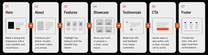
This gives every section enough visual space and detail.
A simple prompt can look like this(with included skill):
> Use the frontend web image skill above.
> Generate a section-by-section website concept for a premium local flower business called Seven Flowers.
> Create one separate image for each section:
> 1. Hero
> 2. About
> 3. Product / bouquet showcase
> 4. Services
> 5. Testimonials
> 6. CTA
> 7. Footer
> Style direction: minimal, editorial, calm, high-end, warm, natural. Avoid generic SaaS visuals, fake dashboard cards, gradient blobs, and overdesigned AI aesthetics.
If you are just brainstorming, you can stay broader:
> Use the frontend web image skill above.
> Generate 6 separate website section concepts for a clean SaaS landing page. Keep it minimal, creative, and implementation-friendly. One image per section.
But do not be too vague. Give at least a basic product, industry, style, or mood.
So another example:
Bad: make a cool website
Better: Design a minimal but creative landing page for an AI note-taking app for students. Make it calm, structured, slightly playful and not like a generic startup website. Generate one image per section.
## Step 2: use style words that actually mean something
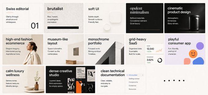
Do not say “modern”. “Modern” means almost nothing now.
Be more precise. Use style directions that affect the layout and art direction.
Examples:
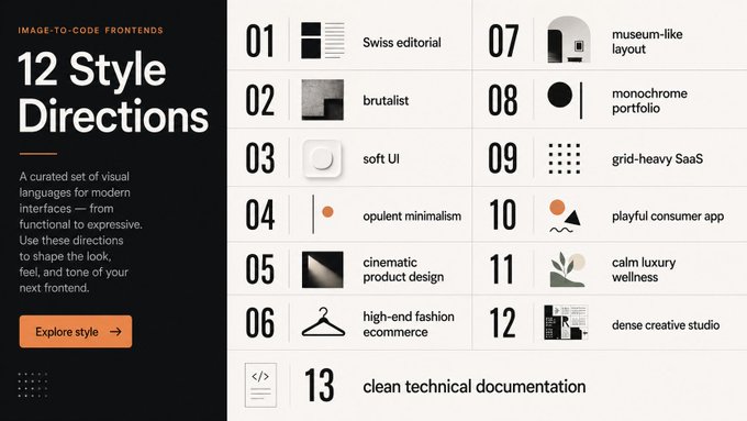
You can also describe composition:
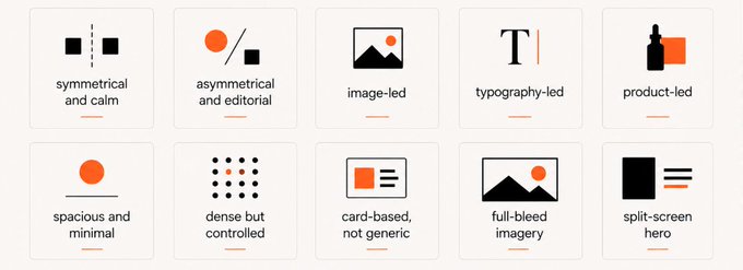
In image generation words like “very creative” can actually help though. In coding prompts, “be creative” often gives weird or messy results. In image generation, it often pushes the model toward more interesting layout ideas based on my tests.
Use it, but combine it with constraints.
Example: Be creative, but keep the layout realistic, premium, clean, and easy to implement in a real frontend.
## Step 3: generate multiple directions and pick the best parts
Run the same prompt multiple times. Open different chats. Compare the outputs.
Usually, one generation has the best hero, another has the better feature section, and another has a stronger CTA. You can mix the best ideas.
Once you find something you like, refine it directly.
Examples:
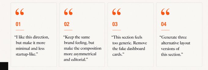
## Step 4: extract the assets
Good websites need good assets.
The generated website images will often contain strong visual elements: product photos, abstract 3D shapes, illustrations, background textures, device mockups, icons, or decorative objects.
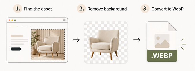
The easiest method to get these assets is to use image generation again.
Open a new chat, upload the website section image and ask the model to generate and extract the asset.
Important: say “generate and extract,” not only “extract” because otherwise ChatGPT will just crop the images out.
Example:
Generate and extract the abstract 3D object from the top-right of this website hero image. Keep it isolated, clean, high resolution
-> Then repeat this for every asset you need.
If the asset needs transparency, remove the background with a background remover. I usually use Adobe Express Remove Background for this.
After that, convert the final images to WebP before using them on the website. For that, I use cxnvert. (built that myself, opensource and fully free, no signup or anything)
## Step 5: turn the images into code
Now you bring everything into your coding agent.
This can be Cursor, Codex, Claude Code or any agentic coding setup that can read images and modify your project.
The key is patience.
Do not dump the whole website into the agent and say:
copy all of this exactly
That usually produces weak results.
Build section by section.
Start with the hero.
Give the agent:
- the hero section image
- the extracted assets for that section
- the names of the asset files
- clear instructions to recreate the layout
- the tech stack and project structure
Review the result.
The first attempt probably will not be perfect. That is normal.
Refine it.
## Step 6: refine with screenshots
After the agent builds a section, take a screenshot of the result. Compare it to the reference image.
Pay attention to:
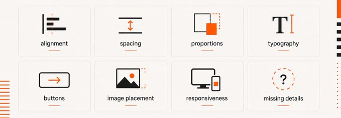
Then give the screenshot back to the agent with specific feedback.
Even better: draw on the screenshot. Use arrows, circles, or notes.
Example:
This is close, but the hero image is too small and too low. Move it higher, increase its size by around 20%, and align the headline baseline more closely with the reference.
Repeat this for every section.
That is the workflow:
1. Reference image
2. Code attempt
3. Screenshot
4. Visual feedback
5. Refinement
6. Next section
## What to pay attention to
Pay special attention to:
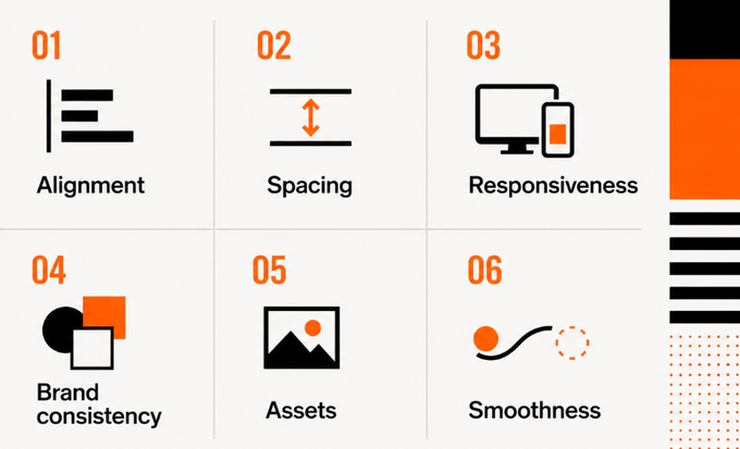
Alignment
Bad alignment instantly makes a site feel cheap. Make sure text, cards, images, and grids sit on a consistent system.
Spacing
Spacing decides whether a website feels premium or messy. Avoid cramped sections, random gaps, and overlapping elements.
Responsiveness
Do not only build for desktop. Check tablet and mobile early. Some image-generated layouts look great in one aspect ratio but need adaptation for real screens.
Brand consistency
Every section should feel like the same website. Colors, typography, image style, buttons, and visual details need to connect.
Assets
Assets carry a lot of the quality. If the images, icons, or 3D objects are weak, the frontend will feel weak too.
Smoothness
The layout should feel intentional. Not random. Not stitched together. Smooth transitions between sections matter.
## Why this unlocks more creative frontends
The main advantage of this workflow is that it gives you a visual design phase right away
So you can explore many directions quickly:
You still need taste. You still need to judge what is good. You still need to refine.
But the workflow gives you a better starting point than asking a coding agent to invent everything from scratch.
Image first. Code second.
That is the whole idea.
## Useful links
- Frontend web image skill: imagegen-frontend-web
- Frontend mobile image skill: imagegen-frontend-mobile
- Background remover: Adobe Express Remove Background
- Image filetype converter: cxnvert
## Final thought
Image-to-code is not that crazy, just takes time. It kind of changes the workflow in a useful way.
For me, this is currently one of the best ways to get AI-built frontends that actually look good.
Generate the design first. Extract the assets. Code section by section. Refine with screenshots.
That is the approach.
## 相关链接
- [Leon Lin](https://x.com/LexnLin)
- [@LexnLin](https://x.com/LexnLin)
- [33K](https://x.com/LexnLin/status/2048791596137632126/analytics)
- [imagegen-frontend-web](https://github.com/Leonxlnx/taste-skill/blob/main/imagegen-skills/frontend-web/SKILL.md)
- [imagegen-frontend-mobile](https://github.com/Leonxlnx/taste-skill/blob/main/imagegen-skills/frontend-mobile/SKILL.md)
- [Adobe Express Remove Background](https://express.adobe.com/home/tools/remove-background)
- [cxnvert](https://cxnvert.vercel.app/)
- [imagegen-frontend-web](https://github.com/Leonxlnx/taste-skill/blob/main/imagegen-skills/frontend-web/SKILL.md)
- [imagegen-frontend-mobile](https://github.com/Leonxlnx/taste-skill/blob/main/imagegen-skills/frontend-mobile/SKILL.md)
- [Adobe Express Remove Background](https://express.adobe.com/home/tools/remove-background)
- [cxnvert](https://cxnvert.vercel.app/)
- [Upgrade to Premium](https://x.com/i/premium_sign_up)
- [11:49 PM · Apr 27, 2026](https://x.com/LexnLin/status/2048791596137632126)
- [33.5K Views](https://x.com/LexnLin/status/2048791596137632126/analytics)
- [View quotes](https://x.com/LexnLin/status/2048791596137632126/quotes)
---
*导出时间: 2026/4/28 17:43:35*