# how to vibe code beautiful startup landing pages (full breakdown from a designer)
**作者**: clear
**日期**: 2026-05-05T18:56:59.000Z
**来源**: [https://x.com/clear_graphics/status/2051737941198647642](https://x.com/clear_graphics/status/2051737941198647642)
---

vibe coding is the practice of building software by describing what you want in natural language and letting an ai agent write the code. f
for landing pages specifically, this has gotten INSANELY good in 2026
this is the exact workflow you can use to go from zero to a beautiful startup page in 4-6 hours...
the tool stack:
- use cursor or claude code for the build
either works but cursor is better if you want to see code changes in real time and claude code is better for longer autonomous runs
Tailwind CSS styles (use this for styling)
- use tailwind css for styling
EVERY prompt should specify tailwind because it's the most well represented css framework in ai training data, so the output quality is significantly better than vanilla css or other frameworks
- framer motion or gsap for animations
specify which one you want in your prompt.
if you don't specify, the ai will just default to basic css transitions which look mid
- vercel for hosting
push to github, connect to vercel, auto deploy
and your page is live in like 2 minutes after the build
the prompting strategy:
the BIGGEST thing people fuck up is prompting for the entire page at once.
"build me a startup landing page" gives you complete shit because the model makes too many decisions simultaneously with no context
instead, build in layers:
layer 1: structure
"create an html file using tailwind css with the following sections: hero, social proof bar, 3 feature sections, testimonial, how it works (3 steps), pricing (3 tiers), faq, and final cta. leave all text as placeholder. just build the skeleton"
this gives you the layout without worrying about content.
review the structure and adjust section order if needed
layer 2: design system
"apply this design system to the page: primary color #1a1a2e, accent color #e94560, background white, headings in inter bold, body text in inter regular, 16px base font size, 1.6 line height, 80px section padding"
now the page actually has consistent styling.
review it and adjust colors/spacing
layer 3: content
"replace all placeholder text with real copy for a [your product] landing page. the value prop is [one sentence]. the features are [list 3]. the social proof is [describe]. keep all text concise and benefit focused"
layer 4: polish
"add subtle animations: fade in on scroll for each section, a smooth hover effect on the cta buttons, and a logo scroll animation for the social proof bar. use framer motion"
you can even add an animation like stripe has in the middle of their landing page:
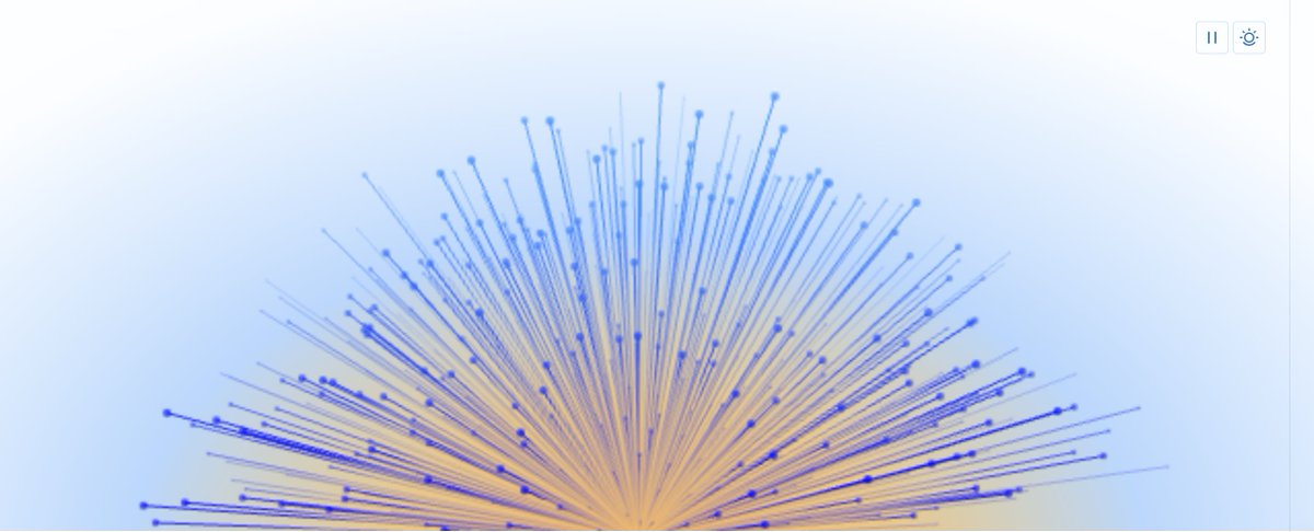
Stripe's beautiful animation in the middle of their landing page
layer 5: mobile
"make the page fully responsive. on mobile: stack the hero elements vertically, make cta buttons full width, reduce heading sizes by 30%, reduce section padding to 40px, disable the logo scroll animation"
what makes vibe coded pages look good vs garbage:
- specificity in prompts
"make it look nice" produces shit and "use a dark navy gradient background (#0a0a1a to #1a1a3e), large white headline text at 56px, and an accent color of #4f46e5 only on the cta button and interactive elements" produces a page that looks DESIGNED
- reference real pages
"style this hero section like stripe's homepage but with my brand colors" works because the ai has seen stripe's page in training data and understands the visual language
- consistent spacing
always specify your spacing scale in the prompt
"use 8px, 16px, 24px, 32px, 48px, 64px, 80px as the only spacing values. no other values"
- limit colors
"use only these 4 colors throughout the entire page: [list them]" when the ai picks random colors per section, the page looks incoherent
- real product screenshots
generate the page with placeholder images and then manually replace them with actual screenshots of your product.
ai generated placeholder images always look fake (because they are lol)
the gap between a vibe coded page and a professionally designed one is smaller than ever BUT there still is and will always be a considerably sized gap)
- clear
also, drop me a follow because im going to be dropping A LOT of valuable breakdowns and pure sauce like this in the future
## 相关链接
- [clear](https://x.com/clear_graphics)
- [@clear_graphics](https://x.com/clear_graphics)
- [#1a1a2e](https://x.com/search?q=%231a1a2e&src=hashtag_click)
- [#e94560](https://x.com/search?q=%23e94560&src=hashtag_click)
- [#0a0a1a](https://x.com/search?q=%230a0a1a&src=hashtag_click)
- [#1a1a3e](https://x.com/search?q=%231a1a3e&src=hashtag_click)
- [#4f46e5](https://x.com/search?q=%234f46e5&src=hashtag_click)
- [Upgrade to Premium](https://x.com/i/premium_sign_up)
- [2:56 AM · May 6, 2026](https://x.com/clear_graphics/status/2051737941198647642)
- [6,045 Views](https://x.com/clear_graphics/status/2051737941198647642/analytics)
- [View quotes](https://x.com/clear_graphics/status/2051737941198647642/quotes)
---
*导出时间: 2026/5/6 21:00:42*
---
## 中文翻译
# 如何使用 Vibe Coding 构建精美的初创公司落地页(设计师的全流程拆解)
**作者**: clear
**日期**: 2026-05-05T18:56:59.000Z
**来源**: [https://x.com/clear_graphics/status/2051737941198647642](https://x.com/clear_graphics/status/2051737941198647642)
---

Vibe coding 是一种通过自然语言描述你想要的内容,并让 AI 代理编写代码来构建软件的实践。对于落地页来说,这项技术在 2026 年已经变得**极其出色**。
这正是你可以使用的工作流程,能在 4 到 6 小小时内从零开始构建一个精美的初创公司落地页……
**工具栈:**
- 使用 **Cursor** 或 **Claude Code** 进行构建
两者都可以,但如果你想实时看到代码更改,Cursor 更好;如果你需要更长时间的自主运行,Claude Code 更好。

**Tailwind CSS 样式(用于样式设计)**
- 使用 **Tailwind CSS** 进行样式设计
**每一个**提示词都应该指定 Tailwind,因为它是 AI 训练数据中代表性最强的 CSS 框架,所以输出质量显著优于原生 CSS 或其他框架。
- **Framer Motion** 或 **GSAP** 用于动画效果
在提示词中指定你想要哪一个。
如果你不指定,AI 默认只会使用基本的 CSS 过渡效果,看起来很一般。
- **Vercel** 用于托管
推送到 GitHub,连接到 Vercel,自动部署。
在构建完成后,大约 2 分钟内你的页面就能上线了。
**提示词策略:**
人们最容易**搞砸**的一点就是一次性提示生成整个页面。
“给我建一个初创公司落地页”会给你带来一堆垃圾,因为模型在没有上下文的情况下同时做了太多的决定。
相反,要分层构建:
**第 1 层:结构**
“创建一个使用 Tailwind CSS 的 HTML 文件,包含以下部分:首屏、社会证明栏、3 个特性部分、用户评价、工作原理(3 个步骤)、定价(3 个等级)、常见问题 (FAQ) 和最终的行动号召 (CTA)。所有文本保留为占位符。只需搭建骨架。”
这会给你一个布局,而无需担心内容问题。
检查结构,如有需要调整部分的顺序。
**第 2 层:设计系统**
“将此设计系统应用于页面:主色 #1a1a2e,强调色 #e94560,背景白色,标题使用 Inter 粗体,正文使用 Inter 常规,基础字号 16px,行高 1.6,部分内边距 80px。”
现在页面实际上有了一致的样式。
检查它并调整颜色/间距。
**第 3 层:内容**
“将所有占位符文本替换为 [你的产品] 落地页的真实文案。价值主张是 [一句话]。功能是 [列出 3 个]。社会证明是 [描述]。保持所有文本简洁并专注于利益点。”
**第 4 层:打磨**
“添加微妙的动画:每个部分的滚动淡入效果,CTA 按钮上的平滑悬停效果,以及社会证明栏的 Logo 滚动动画。使用 Framer Motion。”
你甚至可以添加一个像 Stripe 在他们落地页中间那样的动画:

Stripe 落地页中间的精美动画
**第 5 层:移动端**
“使页面完全响应式。在移动端上:首屏元素垂直堆叠,CTA 按钮全宽,标题大小减小 30%,部分内边距减少到 40px,禁用 Logo 滚动动画。”
**是什么让 vibe coded 页面看起来好看而不是像垃圾:**
- **提示词的具体性**
“让它看起来好看”会产生垃圾,而“使用深海军蓝渐变背景(#0a0a1a 到 #1a1a3e),56px 的大号白色标题文本,并且仅在 CTA 按钮和交互元素上使用 #4f46e5 作为强调色”会产生一个看起来经过**设计**的页面。
- **参考真实页面**
“像 Stripe 首页那样设计这个首屏部分,但使用我的品牌颜色”是有效的,因为 AI 在训练数据中见过 Stripe 的页面,并理解其视觉语言。
- **一致的间距**
始终在提示词中指定你的间距比例。
“仅使用 8px, 16px, 24px, 32px, 48px, 64px, 80px 作为间距值。不要使用其他值。”
- **限制颜色**
“在整个页面中仅使用这 4 种颜色:[列出它们]” 当 AI 为每个部分随机挑选颜色时,页面看起来不连贯。
- **真实的产品截图**
先用占位符图片生成页面,然后手动替换为你产品的实际截图。
AI 生成的占位符图片总是看起来很假(因为确实是假的,哈哈)。
vibe coding 生成的页面与专业设计的页面之间的差距比以往任何时候都小,但**仍然存在,而且永远会有一个相当大的差距)**
- clear
另外,关注我一下,因为我未来会发布很多像这样有价值的拆解和纯粹的干货
## 相关链接
- [clear](https://x.com/clear_graphics)
- [@clear_graphics](https://x.com/clear_graphics)
- [#1a1a2e](https://x.com/search?q=%231a1a2e&src=hashtag_click)
- [#e94560](https://x.com/search?q=%23e94560&src=hashtag_click)
- [#0a0a1a](https://x.com/search?q=%230a0a1a&src=hashtag_click)
- [#1a1a3e](https://x.com/search?q=%231a1a3e&src=hashtag_click)
- [#4f46e5](https://x.com/search?q=%234f46e5&src=hashtag_click)
- [Upgrade to Premium](https://x.com/i/premium_sign_up)
- [2:56 AM · May 6, 2026](https://x.com/clear_graphics/status/2051737941198647642)
- [6,045 Views](https://x.com/clear_graphics/status/2051737941198647642/analytics)
- [View quotes](https://x.com/clear_graphics/status/2051737941198647642/quotes)
---
*导出时间: 2026/5/6 21:00:42*