# how stripe's landing page uses a psychological trick called "processing fluency" to increase trust
**作者**: clear
**日期**: 2026-04-16T17:02:39.000Z
**来源**: [https://x.com/clear_graphics/status/2044823800735498728](https://x.com/clear_graphics/status/2044823800735498728)
---
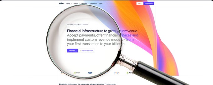
stripe's landing page uses a psychological trick called "processing fluency" that makes visitors trust them within 3 seconds while most startup landing pages do the exact opposite.
let me give you the full breakdown...
what processing fluency actually is:
processing fluency is a cognitive bias where your brain associates ease of understanding with trustworthiness.
if something is easy to read and process, your brain AUTOMATICALLY assumes it's more credible, more professional, and more legitimate
this is backed by decades of research too btw
princeton published a study showing that stocks with easier to pronounce ticker symbols actually performed better in the short term because investors perceived them as less risky.
the information was identical but the readability completely changed the perception
stripe understood this MUCH better than any other tech company
what stripe actually does:
look at their page. the first thing you see is a massive amount of social proof:
companies like amazon, google, shopify.
numbers like "millions of companies" and "billions in payments processed"
but what most people miss is that all the proof is presented in the SIMPLEST possible format
- clean sans-serif fonts
- massive amounts of white space
- short sentences
- zero clutter
- no competing visual elements
- no popups
- no chat widgets
- no banners
- etc.
your brain processes the information instantly
you don't have to work to understand what stripe does or why you should trust them.
and because you don't have to work, your brain concludes: this is legit
that's processing fluency in ACTION
why most startup pages fail at this:
most founders think more information = more trust so they cram everything onto the landing page
feature lists. technical specs. integration logos. blog links. newsletter signups. chatbots. exit intent popups. three different ctas above the fold
every additional element COMPETES for cognitive bandwidth.
the more your visitor's brain has to work, the less they trust you because their subconscious reads complexity as uncertainty
a cluttered page signals: "we're not sure what's most important so we're showing you everything and hoping something sticks"
a clean page signals: "we know exactly what we do and we're confident enough to let it speak for itself"
the specific techniques stripe uses:
1. one clear value proposition above the fold: "payments infrastructure for the internet."
its six words. you know EXACTLY what they do
2. gradient background with a single product screenshot
your eye has only one place to go
3. social proof directly under the hero
itsnot hidden at the bottom or on a separate page.
its immediately visible so trust is established BEFORE you scroll
4. numbers formatted for instant processing
"$1T+" not "$1,000,000,000,000+"
your brain reads the first version in half a second while the second version takes 3-4 seconds.
that difference matters more than you think
5. short paragraphs
most sections are 1-2 sentences so the page reads like a conversation, not a fucking whitepaper
6. negative space everywhere
the space between elements is just as designed as the elements THEMSELVES.
white space gives your brain breathing room to process each piece of information before the next one arrives
how to apply this to your startup:
first, cut 50% of your landing page content.
whatever you have right now, just cut half of it. y
ou probably won't miss anything important and the remaining content will hit harder
second, make your value prop fit in under 10 words
if you can't explain what you do in one short sentence, your landing page will ALWAYS underperform because visitors have to think too hard lma
third, move social proof above the fold or immediately below it
logos, numbers, testimonials.
the first 3 seconds of a page visit determine whether someone keeps scrolling or bounces.
trust needs to be established in that window
fourth, kill the clutter
one cta per section
no competing navigation elements
no chat widgets on the landing page
every element should serve one purpose: move the visitor toward the single action you want them to take
fifth, use simple fonts at readable sizes
no custom display fonts that sacrifice readability for personality.
stripe uses a clean sans-serif at large sizes. your brain processes it EFFORTLESSLY which means it trusts the content more
i've designed for companies like @instinct_inc and @spermracing and the pages that convert best are always the ones with the least stuff on them
it sounds pretty counterintuitive until you actually understand the psychology
also, dm me @clear_graphics if you're a startup and want me to build a high converting landing page (that looks good asf and is suited to your brand) for you
- clear
## 相关链接
- [clear](https://x.com/clear_graphics)
- [@clear_graphics](https://x.com/clear_graphics)
- [57K](https://x.com/clear_graphics/status/2044823800735498728/analytics)
- [@instinct_inc](https://x.com/@instinct_inc)
- [@spermracing](https://x.com/@spermracing)
- [@clear_graphics](https://x.com/@clear_graphics)
- [Upgrade to Premium](https://x.com/i/premium_sign_up)
- [1:02 AM · Apr 17, 2026](https://x.com/clear_graphics/status/2044823800735498728)
- [57.4K Views](https://x.com/clear_graphics/status/2044823800735498728/analytics)
- [View quotes](https://x.com/clear_graphics/status/2044823800735498728/quotes)
---
*导出时间: 2026/4/17 22:11:29*