# the landing page structure that 5 of the top YC funded companies use (full breakdown)
**作者**: clear
**日期**: 2026-04-21T17:44:21.000Z
**来源**: [https://x.com/clear_graphics/status/2046646231498121519](https://x.com/clear_graphics/status/2046646231498121519)
---
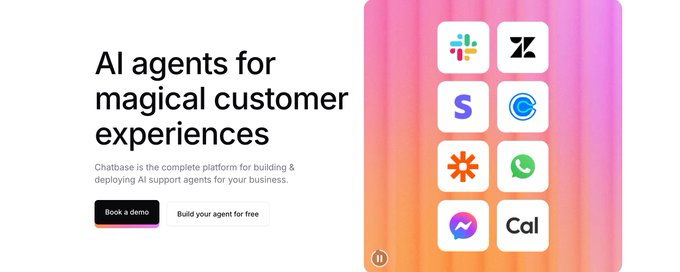
i studied the landing pages of 5 of the most successful yc companies from the last few batches.
the structure is almost IDENTICAL across all of them.
here's the exact pattern:
you've probably heard of the companies:
- resend (developer email infrastructure)
- chatbase (ai chatbot builder)
- artisan (ai sdr)
- deel (global payroll)
- vanta (security compliance)
they have completely different products and icp but the page structure is nearly identical
pattern 1: one-line hero with product screenshot
every single one of these companies has a hero section with a headline under 10 words and a real screenshot of the product in action
it NEEDS to be the actual ui
chatbase shows their chatbot builder interface.
resend shows their email dashboard
artisan shows their ai agent in action
vanta shows their compliance dashboard
why this works:
it immediately answers "what does this product look like" which is the first question every visitor has.
screenshots also build trust because they prove the product exists and is actually polished
pattern 2: social proof within the first scroll
ALL five companies show customer logos or a usage metric before you scroll past the first viewport
resend: "trusted by the best teams." plus developer tool logos
chatbase: trusted by 10k businesses worldwide
artisan: before/after and number of people using it
deel: "40,000+ companies"
vanta: recognizable security-conscious brand logos
this social proof appears within 500 pixels of the page top
its IMMEDIATELY visible
pattern 3: one clear cta repeated
every page has ONE primary action.
"get started" or "start free trial" or "book a demo."
this same cta appears in the hero, after the first feature section, and at the bottom of the page
none of them have competing actions in the hero.
no "watch a demo" alongside "get started" bullshit
they have one action that is repeated consistently throughout the page so the visitor never has to scroll back up to convert
pattern 4: founder photos somewhere on the page
this one surprised me because 4 out of 5 had founder photos or team photos visible on the landing page.
they were usually in an "about" or "backed by" section
why this matters for startups specifically:
investors and early adopters NEED to know who's behind the product.
a face makes the company feel real and approachable
faceless startups feel risky asf (and lifeless)
at the early stage this is a huge trust signal.
and at later stages (like deel) it shifts to investor logos and press mentions
but early on, showing your face is one of the most (maybe the most) underrated conversion tactics
pattern 5: pricing visible and simple
4 out of 5 had pricing visible on the landing page or one click away and even the ones with enterprise pricing showed a free tier or starting price
hidden pricing is a conversion KILLER for developer tools and smb products
these companies know their buyers want to self-qualify immediately.
putting up a "contact sales" wall at the early stage is a mistake unless your minimum deal size is like $50k+
pattern 6: feature sections limited to 3-6
none of these pages listed more than 4 core features on the main page. each feature had its own section with a visual, a headline, and 1-2 sentences of explanation
resend shows 6 features. chatbase shows 5-6. artisan shows 3 with a before/after comparison
they all understand that fewer features presented well DESTROYS a long feature list that nobody reads
pattern 7: the page ends with action not information
every page ends with a final cta block.
has to be a clear call to action with a benefit driven headline and an actual button or link lol
"start building in minutes" or "get compliant faster" and then the button
should be the last thing the visitor sees before they either convert or leave
the visitors who scroll to the bottom of your page are your warmest traffic and the final cta is your last chance to convert them so make it count
the framework summarized:
hero (headline + screenshot + cta) → social proof bar → problem statement → 3-4 feature sections → testimonial → how it works → pricing → founder/team → final cta
this structure fucking prints because it follows how the brain processes a purchase decision:
what is this → who uses it → what problem does it solve → how does it work → what does it cost → who built it → should i try it
enjoy the sauce
also, dm me @clear_graphics if you want a banger landing page built for your startup with this structure and so much more
- clear
## 相关链接
- [clear](https://x.com/clear_graphics)
- [@clear_graphics](https://x.com/clear_graphics)
- [105K](https://x.com/clear_graphics/status/2046646231498121519/analytics)
- [@clear_graphics](https://x.com/@clear_graphics)
- [Upgrade to Premium](https://x.com/i/premium_sign_up)
- [1:44 AM · Apr 22, 2026](https://x.com/clear_graphics/status/2046646231498121519)
- [105K Views](https://x.com/clear_graphics/status/2046646231498121519/analytics)
- [View quotes](https://x.com/clear_graphics/status/2046646231498121519/quotes)
---
*导出时间: 2026/4/22 20:54:11*