# DESIGN.md | The One File AI Needs to Match Your UI
**作者**: George from prodmgmt.world
**日期**: 2026-04-26T09:07:02.000Z
**来源**: [https://x.com/nurijanian/status/2048327986777350425](https://x.com/nurijanian/status/2048327986777350425)
---

A year ago, PMs worried they could not get from idea to screen. Now they can get ten screens in ten minutes, and the problem is whether any of them look like the same product.
Ask an agent for a settings screen, an onboarding modal, a dashboard, and a pricing page. Each one may look fine in isolation. Put them together and you get four different products wearing the same logo.
Designers solved this years ago with design systems.

Agents need something similar, but Figma is mostly invisible to them and brand PDFs are worse. DESIGN.md puts the rules where agents actually look: in text, inside the repo.
Google’s Stitch team describes it as a plain-text design system document for AI agents. It sits in your project and tells the agent how the product should look and feel: colors, type, spacing, component rules, layout principles, and the do’s and don’ts that keep screens from wandering off.
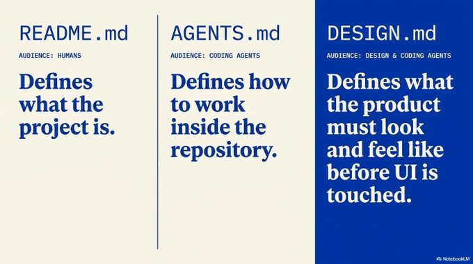
AGENTS.md is the closest comparison.
- README.md tells humans what the project is.
- AGENTS.md tells coding agents how to work inside the repo.
DESIGN.md tells design and coding agents what the product should look like.
## What DESIGN.md contains
A DESIGN.md file has two layers.
1. The first is machine-readable YAML: colors, type, radius, spacing, component references, and exact component properties.
2. The second is human-readable markdown: what the interface should feel like, which colors do which jobs, how layout behaves, which component patterns are allowed, and which ones should never appear.
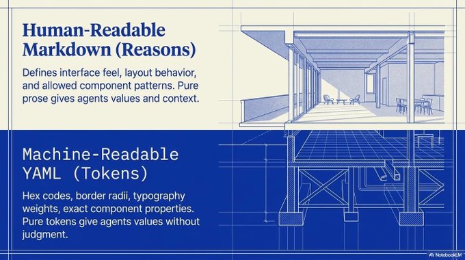
Agents need values and reasons.
Pure prose gives the agent mood words: “clean,” “premium,” “friendly,” “modern.” Most of those words are useless until you attach them to decisions.
Pure tokens give the agent values without judgment. A hex code does not tell the agent whether that color should appear on every button, only on the primary action, or never on a background.
With both, the agent gets exact values, humans get the reasons, and the PM, designer, engineer, and agent have one thing to argue over.
You do not have to pretend to be the designer. You just have to write down enough product judgment that the agent stops freelancing.
## The PM version of the problem
Most PMs already know the pain this solves.
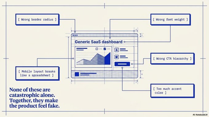
You ask for a prototype and the output looks “pretty good.” Then a designer looks at it and sees the problems:
- Wrong radius
- Wrong font weight
- Wrong CTA hierarchy
- Too much accent color
- New card style invented for no reason
- Form fields that do not match the product
- Mobile layout that breaks like a spreadsheet
- Empty state that sounds like a SaaS brochure
None of these are catastrophic alone.
Together, they make the product feel fake.
The agent did what you asked with incomplete context.
I think this is the part PMs need to get used to. When AI makes UI cheap, the hard part moves from generating the screen to knowing whether the screen belongs in the product.
Once AI does more of the making, PM judgment matters more.
Also, many UI leaves are exactly the kind of work an agent can draft if everyone knows what “good” is supposed to look like. (There’s a skill in my PM OS for identifying these leaves, by the way. Scroll to the bottom when done reading.)
## How to apply it
Create a DESIGN.md before you ask the agent to build UI.
In practice, I would do it this way.
1. Start from a real source
Begin somewhere more specific than “make it beautiful.”
Use one concrete source:
- Your existing app
- A public marketing site
- A Figma file
- A screenshot of a screen you like
- A reference DESIGN.md from a collection like awesome-design-md or getdesign.md
If the product already exists, ask the agent to infer the first draft from the current UI. If the product is new, pick a reference direction first.
2. Capture decisions, not vibes

A weak DESIGN.md says:
- Minimal
- Premium
- Clean
- Friendly
A stronger DESIGN.md says:
- Use one accent color per screen, reserved for the main action.
- Body text should stay at 15-16px with line height above 1.4.
- Cards use border and surface contrast instead of heavy shadows.
- Primary buttons are filled. Secondary actions are text or outline.
- Empty states should be direct and functional, with restraint around playfulness.
- Tables should prioritize scan speed over decorative spacing.
- Mobile screens should collapse secondary metadata before primary actions.
PMs can help here because even without the final shadow token, they can still name the product judgment: dense or spacious, playful or sober, action-heavy or review-heavy, consumer-feeling or enterprise-feeling, expressive or quiet.
3. Fill the sections agents use
Google’s basic shape:
- Overview, colors, typography, layout
- Elevation, shapes, components
- Do’s and don’ts
The spec allows unknown sections, which is useful because products have weird constraints.
For example, a B2B workflow product might need:
- Data density rules
- Table behavior
- Error-state tone
- AI confidence display rules
A consumer app might need:
- Image treatment
- Motion rules
- Empty-state personality
Bad output is easier to spot when the rule is written down.
4. Make the agent cite the file back to you
The underused move is making the agent cite the file back to you.
Attaching DESIGN.md and hoping is too passive.
After the agent generates a screen, ask it to review its own output against the file.
Use prompts like:
- List the DESIGN.md rules this screen follows.
- List any places where this screen invented a new pattern.
- Compare the button, card, input, typography, spacing, and mobile behavior against DESIGN.md.
- Before changing the UI, state which section of DESIGN.md justifies the change.
- If DESIGN.md is silent, say so and ask whether to extend the file.
The last prompt is where the file becomes alive. When a new product decision appears, you can either treat it as a one-off or add it back into the system.
5. Pair it with human review
Think of DESIGN.md as writing down the decisions you do not want the agent to keep remaking.
It cannot tell you whether the product should feel more like Linear, Notion, Ramp, Workday, or something else entirely. It cannot decide what the screen should make the user feel.
The file does a narrower job. It stops the agent from making every screen feel like a new product.
Expecting the file to replace designers is the wrong read. The better use is letting designers and PMs encode decisions once so agents stop re-litigating them screen by screen.
## The PM checklist for DESIGN.md
If I were adding DESIGN.md to a PM workflow, I would use this checklist.
Use it for four kinds of work: prototypes, UI leaves in a codebase, new agent sessions, and PM-designer alignment.
It also makes design QA less personal. Instead of saying “this feels off,” reviewers can point to the file: CTA hierarchy violates the color rule, the card invented a new elevation pattern, the mobile layout dropped the wrong metadata, the empty-state copy broke the tone rule.
Before creating it
Answer the setup questions first:
- What product surface will this govern?
- Which existing screen is the best taste anchor?
- Which screen is the warning example?
- Is this for exploration, production code, or review only?
- Does the team already have Figma tokens, Tailwind config, brand rules, or component docs?
A DESIGN.md for exploration can be loose. A DESIGN.md for production UI should be stricter, especially around accessibility, component states, and responsive behavior.
What the file must include
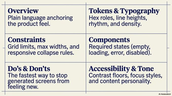
At minimum:
- Overview: what the product should feel like, in plain language
- Color roles: hex values plus jobs for each color
- Typography and spacing: sizes, weights, line heights, density, rhythm
- Components and states: buttons, inputs, cards, navigation, tables, empty, loading, error, disabled
- Layout and responsive behavior: grids, max widths, gutters, what collapses, what stays visible
- Accessibility: contrast, keyboard navigation, focus styles, motion limits
- Do’s and don’ts: the fastest way to stop every generated screen from feeling new
The do’s and don’ts are probably the most PM-friendly section.
They let you encode judgment in normal language:
- Do keep one obvious primary action per screen.
- Do preserve scan speed on operational pages.
- Do use empty states to help the user take the next action.
- Don’t create a new button style without updating this file.
- Don’t use accent color for decoration.
- Don’t hide approval, review, or destructive actions inside low-contrast menus.
- Don’t make dense B2B workflows feel like a consumer landing page.
A PM should be willing to write a sentence that specific.
How to use it in prompts
Put DESIGN.md in the prompt and make the agent prove it followed the file:
- For generation: Read DESIGN.md first. If the request conflicts with the file, explain the conflict before generating.
- For implementation: Use existing components where possible. If a new pattern is needed, explain why DESIGN.md does not cover it.
- For review: Return only mismatches, missing states, accessibility risks, responsive issues, and places where the design invented a new pattern.
This makes the agent show its work instead of returning a screen that is somehow “cleaner” but still wrong. PMs can work with that.
When to update it
Update DESIGN.md when:
- A new component pattern appears twice
- A designer changes the visual direction
- A PM notices repeated agent mistakes
- A review comment keeps coming back
- A feature area needs different density rules
- A mobile pattern diverges from desktop
- The team decides a one-off pattern should become standard
Avoid updating it for every preference fight.
One person disliking a card radius is feedback. Three screens inventing three different card radii is a system problem.
The failure modes
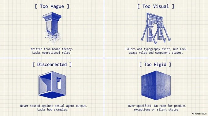
Most bad DESIGN.md files fail in predictable ways:
- Too vague: “modern and clean,” “beautiful enterprise UI,” “simple and intuitive”
- Too visual without being operational: colors with no roles, typography with no usage rules, components with no states
- Too rigid: every section over-specified, no room for product-specific exceptions, no rule for what happens when the file is silent
- Disconnected from real screens: written from brand theory, never tested against agent output, no bad examples documented
Boring is a feature here. Common design decisions should repeat, and genuinely hard product decisions still belong with humans.
## The PM takeaway
I think the point is simple: PMs are going to give agents more UI work, and the good teams will stop treating taste like something everyone can remember.
DESIGN.md is one way to write it down without turning every prompt into a 900-word reminder.
One file in the repo means humans can read it, agents can use it, and the product can change without everyone relying on memory.
Pick one product surface you own and ask an agent to draft a DESIGN.md from the existing UI. Then review it with your designer or engineering partner and fix the parts that are too vague.
After that, use it on one small UI task.
If the output improves, keep going. If it does not, good, now you can see exactly what your design system never spelled out.
Here is a great resource with some example DESIGN.md files.
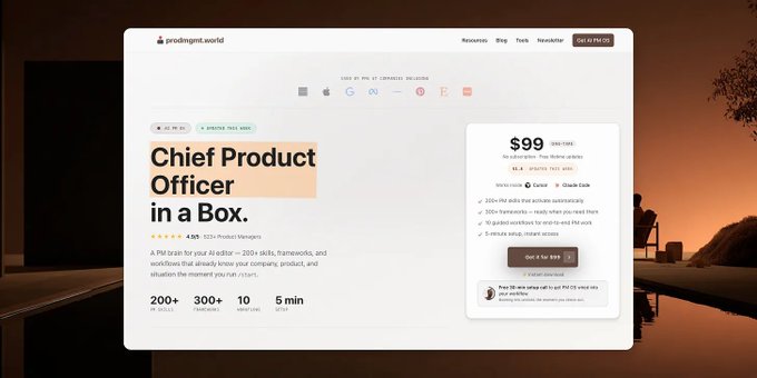
If the next question is “how do I make this repeatable?”, PM OS gives you the setup: 200+ skills, 10 workflows, and the Cursor/Claude Code scaffolding to run agent workflows without rebuilding the process every time.
## AI PM OS v1.8.0 — Project-Based Organization
PM OS now organizes work around projects, not document types.
Before v1.8, strategy docs, research, PRDs, decisions, and measurements could end up scattered across separate folders. Now, each project gets one home in 📂 Context/Work/{project-slug}/, so every artifact for an initiative stays together.
What’s New
- Create and manage project folders with /project: create, list, switch, view the current project, or archive completed work.
- Keep workflow outputs together automatically. Strategy, research, assumptions, decisions, meetings, measurements, and reviews now save into the active project folder.
- Start new work faster. When you describe a new initiative, PM OS can notice that no project exists yet and offer to create one before the workflow starts.
- Pick up where you left off. Project-scoped workflows now do a lightweight prior-work scan, so the agent can reference recent artifacts in the current project before asking what you want to do next.
- Tune the AI’s voice with the new optional 📂 Context/MY_STYLE.md file. Set preferred format, depth, tone, writing notes, decision lens, and time horizon without changing the core PM OS rules.
- New: 3 standalone skills for messy workPM OS now includes 212 skills, including three new standalone tools for problems that do not need a full workflow.
Corporate Misalignment Finder helps you diagnose why teams are stuck: unclear goals, missing facts, broken decision process, fuzzy authority, or decisions that never get captured. Based on Robert’s Rules of Order Newly Revised: 12th Edition
Vibe Code Leaf Finder helps you see where AI can safely edit a codebase, where it needs guardrails, and where an engineer should stay in control. Based on this Anthropic talk.
Workflow Trellis helps you turn messy interviews, customer research, or operational notes into a map of the real workflow: obligations, fragments, handoffs, automation opportunities, and exception queues. Useful especially for B2B SaaS PMs.Use them directly with /skill, or describe the situation in plain language and PM OS will route to the right one.
Improved
- /tidy is now project-aware. It detects artifacts sitting at Work/ root or in legacy folders like PRDs/, Research/, Strategy/, and offers to route them into the right project folder.
- /tidy reminders are more reliable. The hook now works even before the first tidy run, checks for orphaned files, and uses a 12-hour freshness window.
- /start now offers optional setup for communication style and first project creation.
- /migrate now works as a proper slash command in both Cursor and Claude Code.
- Migration no longer silently creates legacy type-based Work folders. It preserves existing files, warns when legacy folders contain content, and lets /tidy handle routing safely.
- Migration now removes empty iCloud “ 2” duplicate folders created by sync conflicts, while preserving any non-empty user data.
Fixed
- Fixed Claude Code not recognizing /migrate as a slash command.
- Fixed /tidy reminder behavior when no tidy state file existed yet.
- Fixed migration cleanup for empty iCloud conflict folders after emoji-folder upgrades.
Upgrade Notes
Run /migrate from an existing v1.7.x project. Your 📂 Context/ files are preserved. Existing legacy Work folders stay in place until you move them manually or run /tidy.
# This release updates PM OS to 1.8.0.
# Upgrade your PM setup with PM OS 1.8
## 相关链接
- [George from prodmgmt.world](https://x.com/nurijanian)
- [@nurijanian](https://x.com/nurijanian)
- [12K](https://x.com/nurijanian/status/2048327986777350425/analytics)
- [Here is a great resource with some example DESIGN.md files](https://getdesign.md/)
- [Robert’s Rules of Order Newly Revised: 12th Edition](https://books.google.co.nz/books/about/Robert_s_Rules_of_Order_Newly_Revised_De.html?id=2Uc9ygEACAAJ&source=kp_book_description&redir_esc=y)
- [Anthropic talk.](https://youtu.be/fHWFF_pnqDk?si=Ol89gef0twxCvtLt)
- [Upgrade your PM setup with PM OS 1.8](https://prodmgmt.world/products/pm-os?utm_source=x&utm_medium=social&utm_campaign=design_md_ai_ui)
- [Upgrade to Premium](https://x.com/i/premium_sign_up)
- [5:07 PM · Apr 26, 2026](https://x.com/nurijanian/status/2048327986777350425)
- [12.7K Views](https://x.com/nurijanian/status/2048327986777350425/analytics)
---
*导出时间: 2026/4/27 09:19:42*