# 30 things to know to become a claude design engineer
**作者**: The Smart Ape
**日期**: 2026-04-17T15:03:46.000Z
**来源**: [https://x.com/the_smart_ape/status/2045493173951103455](https://x.com/the_smart_ape/status/2045493173951103455)
---
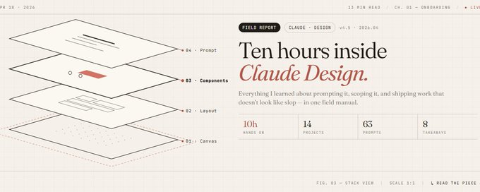
yesterday anthropic lanched claude design. you type a prompt, it spits back a prototype, a pitch deck, a landing page, a one-pager. then you iterate by chatting, commenting inline, or pulling custom sliders it generates for your specific design.
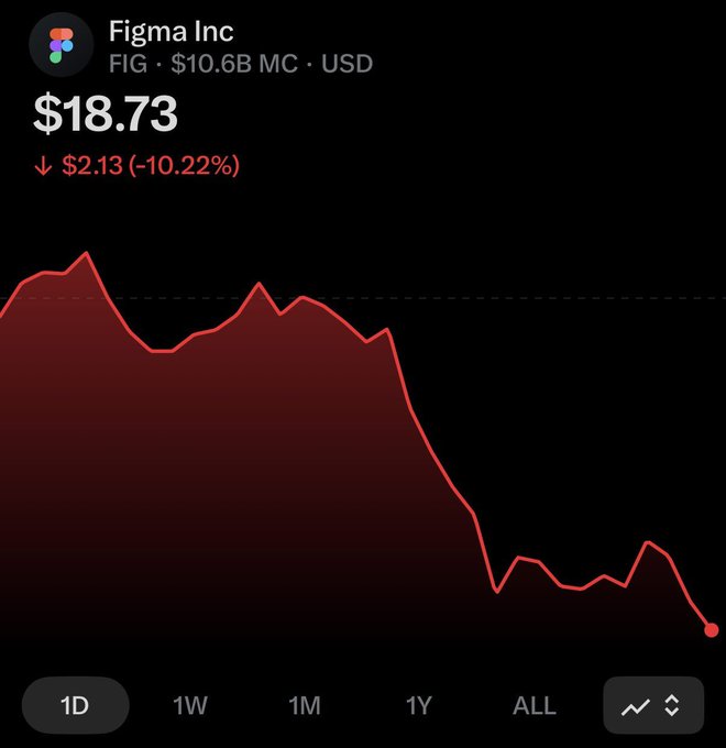
the market didn't take it well. figma's stock dropped 10% the same day. canva's moat got thinner overnight. the freelance "i'll design your pitch deck for $2k" market is cooked, anthropic didn't say it, but datadog's team compressed a week-long design cycle into a single conversation. design isn't the bottleneck anymore. alignment is.
spent the day digging and using it. 30 things below, what it does, what it fumbles, what nobody warns you about, and how to get real work out of it.
1. token burn
pro users are getting locked out after 30 minutes of use. got 60% of my weekly quota gone in two sessions.
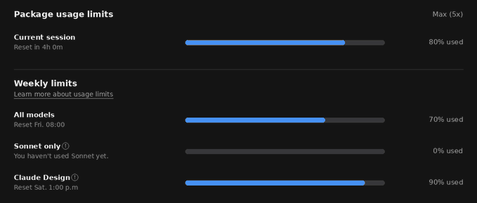
if you plan to use claude design more than twice a week, which you will, max tier the minimum to have. budget accordingly before you get excited about the "free with pro".
2. the onboarding quiz
before it drafts anything, claude design runs a short quiz. clarifying questions about your intent, audience, style. most people answer in one word and wonder why the output is generic.
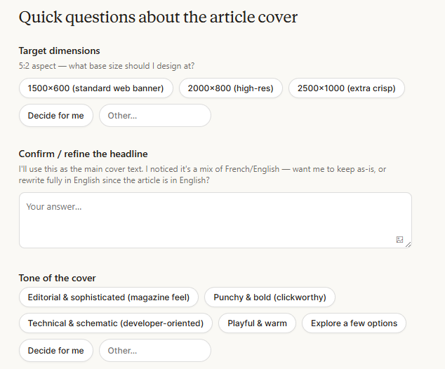
the quality of the quiz answers is the quality floor of the output. treat it like a design brief.
3. prompt-to-result ratio: 2 vs 20
recreating a complex marketing page takes 20+ prompts in competing tools. claude design averages 2. the reason is that opus 4.7 is trained to read intent over literal words. stop over-specifying. say what you mean, let it ask.
4. custom sliders are the killer feature
everyone is talking about prompting. nobody talks about the sliders, which are generated per design (not generic templates).
spacing, density, color warmth, layout tightness, each one is built for your specific artifact.
it's what makes this feel like a design tool and not a prompt box with a preview pane. learn the sliders before you learn the prompts.
ask in the chat to add sliders and they'll appear in the design page.

5. inline comments
most ai design tools regenerate the whole page when you ask for one change. you lose the good parts.
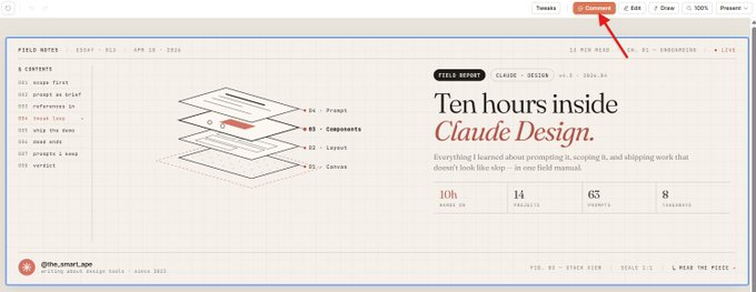
claude design lets you drop a comment on a specific element, and it iterates just that element.
this alone is worth the subscription switch for anyone coming from midjourney or v0.
6. publish design system
once you publish a design system in claude design, it becomes a dropdown option for your entire org. every new project starts from your tokens automatically.
if you skip this, everyone on your team will reinvent colors and typography every project. set this up on day one or never.
7. it reads your codebase
claude design pulls design tokens directly from your repo. if your css variables are named --color-blue-2, --blueish, --primary-old, the output will reflect that chaos. the quality of your design output is now a function of how clean your repo is.
this is the real moat anthropic built: they made your code the source of truth.

8. the default aesthetic is generic saas, ban it explicitly
without constraints, claude design defaults to inter, roboto, arial, and predictable gradients.
it's the yc-batch aesthetic.
to get anything distinctive, you have to ban it in the prompt: "no inter, no generic gradients, no stock blue-to-purple." this isn't in any documentation. it's the first tip every serious user discovers.
9. prompt each design dimension separately
typography, color, motion, backgrounds, prompt them one at a time, not in one paragraph.
the cookbook confirms this: guiding dimensions individually produces consistently better output than a single mega-prompt. combining them gives soup.
10. don't mix build + critique + learn in one prompt
a claude 4.x-era rule that applies fully here: if you ask it to build something, critique it, and explain a concept in the same turn, all three suffer. smaller, more focused turns produce stronger output. separate the verbs.
## 11. "make it clean" is cope, reference real products
generic adjectives are useless. "make it feel like xxxxx app circa 2023 but with more density" works. "make it clean" does not. claude design has seen the internet. use that. reference products, eras, aesthetic movements, not "professional" or "modern."
12. xml tags in prompts give you free structure
wrap your prompt sections in tags like <constraints>, <brand>, <output>, <examples>. claude models are heavily trained on this format. it's the cheapest quality upgrade available and most users still type free-flow prose.
example:
13. datadog compressed a week into a conversation
datadog's product team reportedly compressed a full brief → mocks → review cycle from a week to a single conversation.
the takeaway isn't "faster design." it's that alignment is now the real bottleneck in product work. if your org is slow to decide, claude design won't help you ship faster.
14. export-to-canva
real-time multiplayer editing isn't in claude design yet. the way teams are actually working: draft in claude design → export to canva → collaborate and finalize there. canva is the home, claude design is the starting point.
15. html export is underrated
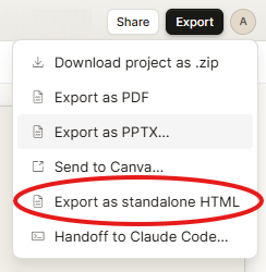
everyone uses pdf and pptx export. the hidden move is html export, you grab a standalone html file, drop it in a repo, and you've shipped a landing page in under 10 minutes.
no figma-to-code translation, no framer. this is the workflow that'll kill "brochure site" dev contracts.
16. export-to-claude-code
the full loop: claude design → claude code → shipped application. designers become the handoff node, not the bottleneck.
this matters because it removes the traditional "design-to-dev translation" step entirely. if you're a designer who doesn't use claude code yet, you're about to be behind.
17. the handoff package is machine-readable
when you send a design to claude code, it's a structured package: layouts, images, dev notes, component annotations, all eaten by a coding agent directly. the spec is no longer a figma file a dev interprets. it's a machine-readable contract.
18. "frontier design" exists and 99% of users don't use it
claude design supports voice, video, 3d, and interactive effects, what anthropic calls "frontier design."
99% of users are still making slide decks.
the upside for anyone building interactive marketing sites, product demos, or portfolios is massive and uncrowded. go here if you want to stand out.
19. it's bad at multi-page flows with strict state logic
on a single screen, claude design is good. on a real user flow with state, branching logic, and page-to-page consistency, it falters.
for production user flows you still need figma + framer. know the boundary so you don't waste tokens trying to push past it.
20. juniors look senior. seniors look slow.
execution speed just became much better. a junior designer with claude design can produce in an hour what took a senior three days.
the defensible value for seniors is now taste, systems thinking, and constraint-setting, not pixel execution. if your value is execution speed, re-skill now.
21. the $2k freelance pitch deck is cooked
this is the market segment dying. any founder can now generate a pitch deck in 30 minutes that would've cost $2k from a freelancer two months ago.
the freelance "design your deck" niche has maybe six months. if that's your gig, pivot to brand strategy, systems, or motion, things claude design can't yet commodify.
22. use it as a thinking tool
the least discussed use: 10 minutes prompting in claude design clarifies a product idea better than 2 hours in figma.
the act of describing the design forces specificity. founders: use it for thinking before you use it for shipping. the slide deck that comes out is almost a bonus.
23. opus 4.7 sees images at higher resolution
it means you can paste screenshots directly.
opus 4.7 is anthropic's strongest vision model yet, with higher-resolution image understanding. paste screenshots of designs you like as inline references. it will extract specific elements, typography choices, spacing, color systems, with accuracy that the previous generation couldn't touch. stop describing, start pasting.

24. plan before you prompt
30 minutes of planning saves hours of iterating. write down your audience, constraints, success criteria, and references before you open claude design.
the users burning through their weekly tokens in two sessions are the ones skipping this step.
25. clear your session between projects
sessions carry context. if you started in "corporate saas" mode and then switch to "edgy consumer app," the first session's assumptions bleed into the second. start a new session per project. this is a token-economy move as much as a quality move.
26. mcp connections
claude design isn't isolated. via mcp, you can connect notion, figma, your database, issue trackers. pull real product data into a prototype. reference your actual design tokens from figma. this is the feature that separates power users from prompt users.

27. brand voice needs actual copy samples
"make the copy punchy" = useless. include 3-4 sentences of your actual brand voice in the prompt, and it will match the cadence. this is the single biggest unlock for marketing artifacts. copy is the hardest part to prompt, and example-driven prompting fixes it immediately.
28. few-shot examples must align exactly
claude 4.x models pay obsessive attention to examples. if you include a screenshot with a grid layout and one card has a subtle shadow, the model will replicate that shadow everywhere. curate examples ruthlessly. one bad example poisons the output.
29. the default aesthetic biases toward "professional"
opus 4.7's safety and aesthetic training pulls toward clean, readable, professional output. that's fine for enterprise. it's death for a consumer brand.
if you want brutalist, y2k, editorial, or anti-design, you have to push hard and repeatedly. expect to override the model's instincts, not go with them.
30. the product has six months before it's commoditized
research preview today. competitors will catch up fast, v0, lovable, framer all have roadmaps pointing here. anthropic's edge is the codebase-reading + design system integration. that's a 6-12 month moat at most. the window to build a reputation as "the person who masters claude design" is now, not q4. if you're reading this, you're early. act like it.
## 相关链接
- [The Smart Ape](https://x.com/the_smart_ape)
- [@the_smart_ape](https://x.com/the_smart_ape)
- [107K](https://x.com/the_smart_ape/status/2045493173951103455/analytics)
- [Apr 17](https://x.com/claudeai/status/2045156267690213649)
- [55M](https://x.com/claudeai/status/2045156267690213649/analytics)
- [Apr 17](https://x.com/canva/status/2045163029138948493)
- [3.3M](https://x.com/canva/status/2045163029138948493/analytics)
- [Apr 18](https://x.com/kail_designs/status/2045236928166203583)
- [Find out more](https://x.com/i/flow/join-birdwatch)
- [1.4M](https://x.com/kail_designs/status/2045236928166203583/analytics)
- [Upgrade to Premium](https://x.com/i/premium_sign_up)
- [9:22 PM · Apr 18, 2026](https://x.com/the_smart_ape/status/2045493173951103455)
- [107.8K Views](https://x.com/the_smart_ape/status/2045493173951103455/analytics)
- [View quotes](https://x.com/the_smart_ape/status/2045493173951103455/quotes)
---
*导出时间: 2026/4/19 20:10:40*