10 个惊艳的 Shader 预设:瞬间提升网站质感 ✍ Nick Stepuk🕐 2026-04-17📦 6.7 KB 🟢 已读 𝕏 文章列表 作者深入研究了 Framer 的 Shader 功能,通过调整和实验,分享了 10 个高级预设效果。文章详细介绍了全息图、热力图、CRT 复古风等 10 种不同的视觉风格,并提供了设置建议和专业技巧,旨在帮助设计师利用 Shader 提升网站的视觉吸引力和高级感。 FramerShader设计灵感前端开发UI/UX视觉效果Web设计代码生成网站优化动画 # 10 glorious shader presets to instantly upgrade your website **作者**: Nick Stepuk **日期**: 2026-04-16T13:21:01.000Z **来源**: [https://x.com/stfnco/status/2044768025786695971](https://x.com/stfnco/status/2044768025786695971) --- 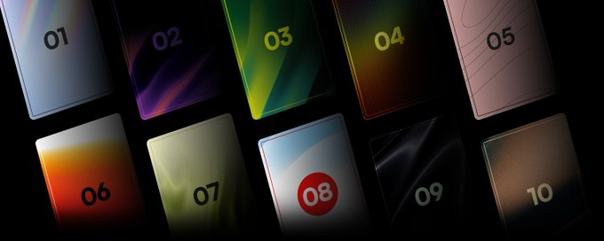 I spent a whole day going deep on @framer shaders — tweaking, experimenting, and pushing them as far as they'd go. Here are 10 advanced presets that came out of that session. Take what you like. 01 — Hologram 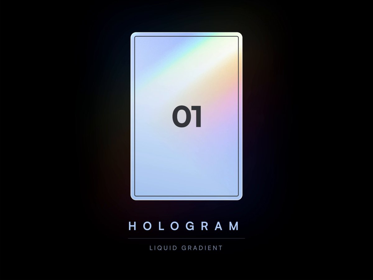 Shader: Liquid Gradient You might've already seen this one — I used it on my recent discount post. It's a simple light refraction effect that mimics the look of holographic foil. Nothing fancy under the hood, but the result is instantly recognizable. Works great on cards, coupons, pricing sections, or anything that benefits from that "premium but playful" feel. Settings: > 💡 Pro tip: Use masks. > The shader doesn't have to fill a rectangle — throw a mask on it and let it bleed into the background. It makes the design feel more premium, keeps text readable underneath, and honestly just looks way cooler. 02 — Heatmap 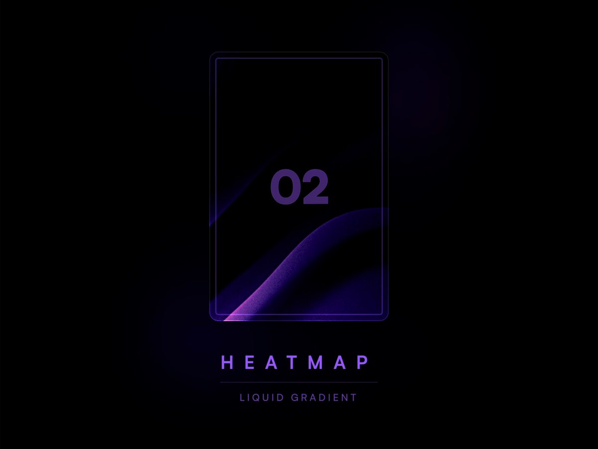 This one's my personal favorite from the whole set. There's something about the way it moves — slow and silky. Dark background, purple heat rising from the bottom, a hint of orange at the edges. If you're building anything with a dark, moody atmosphere, this is your go-to. Settings: > 💡Pro tip: Crop it. > You don't have to show the whole shader — just the part that looks best. In this preset, for example, I used only the bottom-left quarter. It fits the composition way better and makes the effect feel more intentional. 03 — Citrus 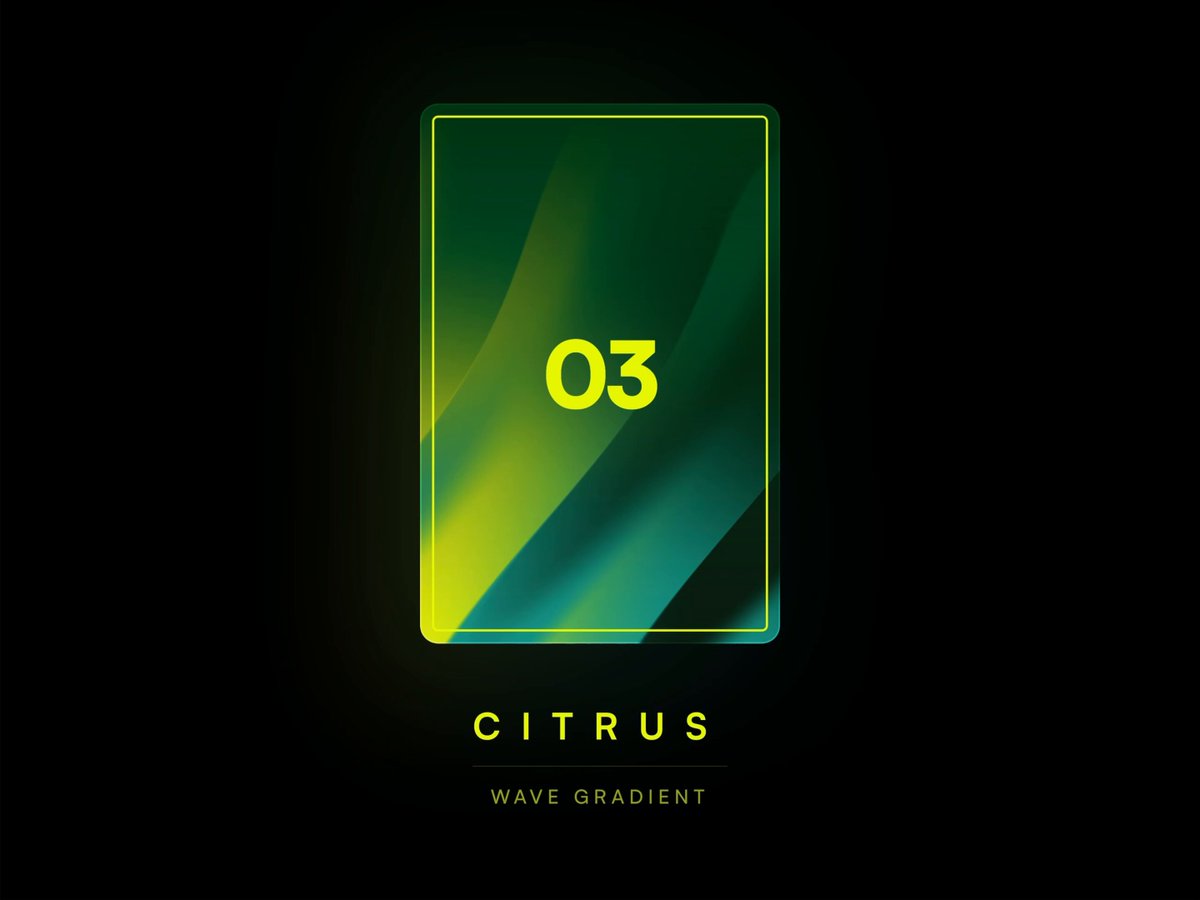 Not everything has to be dark and cosmic. I wanted something playful for a change, so I paired acid yellow with deep greens. The diagonal waves give it energy, and the colors manage to feel fresh without looking cheap. A good pick when you want your project to feel alive and fresh. Settings: 04 — CRT 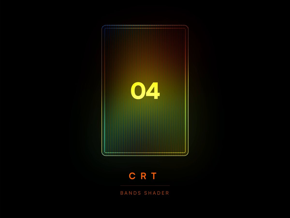 I was going for that old CRT television feel here. Vertical scan lines, warm amber and red tones bleeding through the dark. It came out really nostalgic and cozy in a way I didn't quite expect. If your project has any retro or vintage direction, this one fits right in. Settings: 05 — Topo 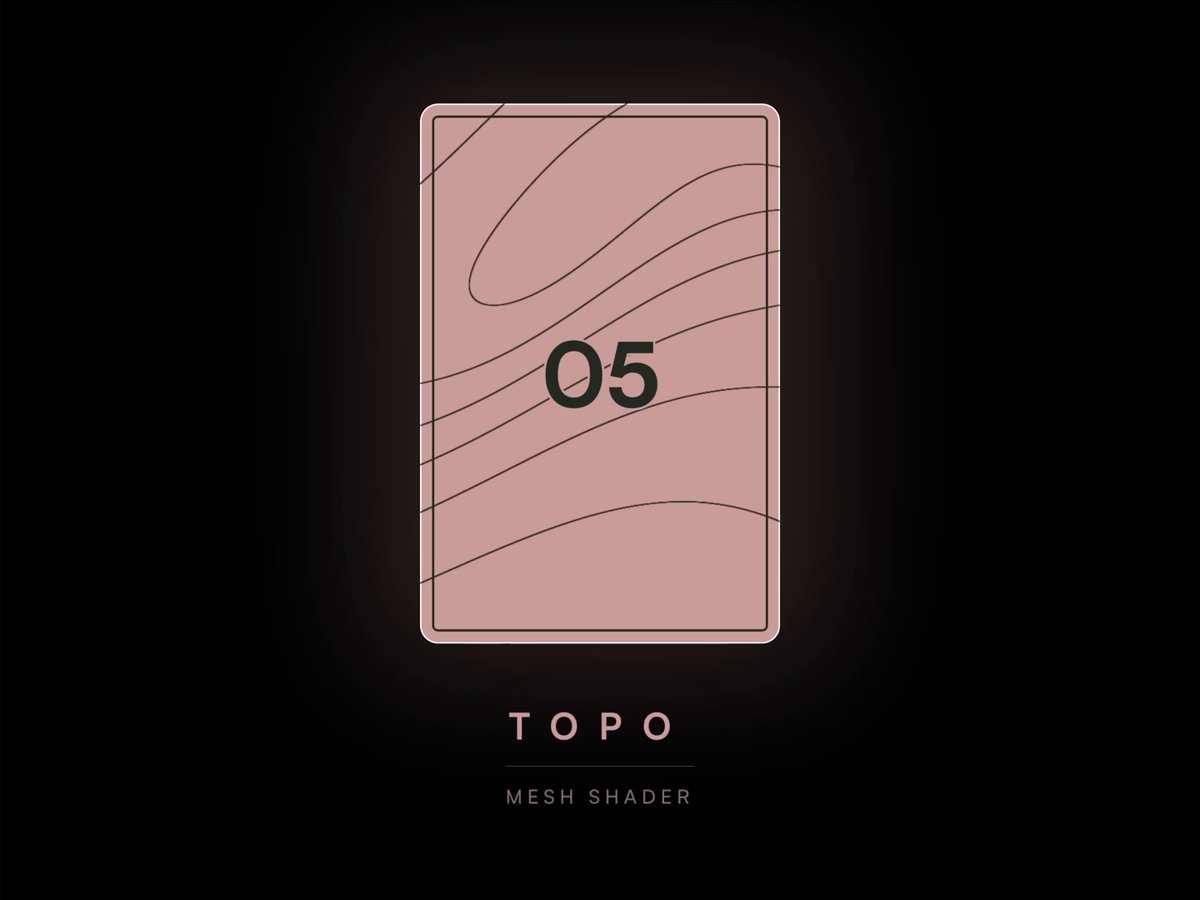 You can use shaders in a flat, minimal design too. This one is just two colors and clean topographic lines flowing across a flat surface. In motion it looks refined and a bit editorial. Also one of the fastest rendering presets in the set. Settings: > 💡 Pro tip: Play with Seed. > Every preset has a Seed parameter that randomizes the shader pattern. If the current look doesn't quite fit your project, just change the number and you'll get a completely different variation of the same effect. 06 — Solar 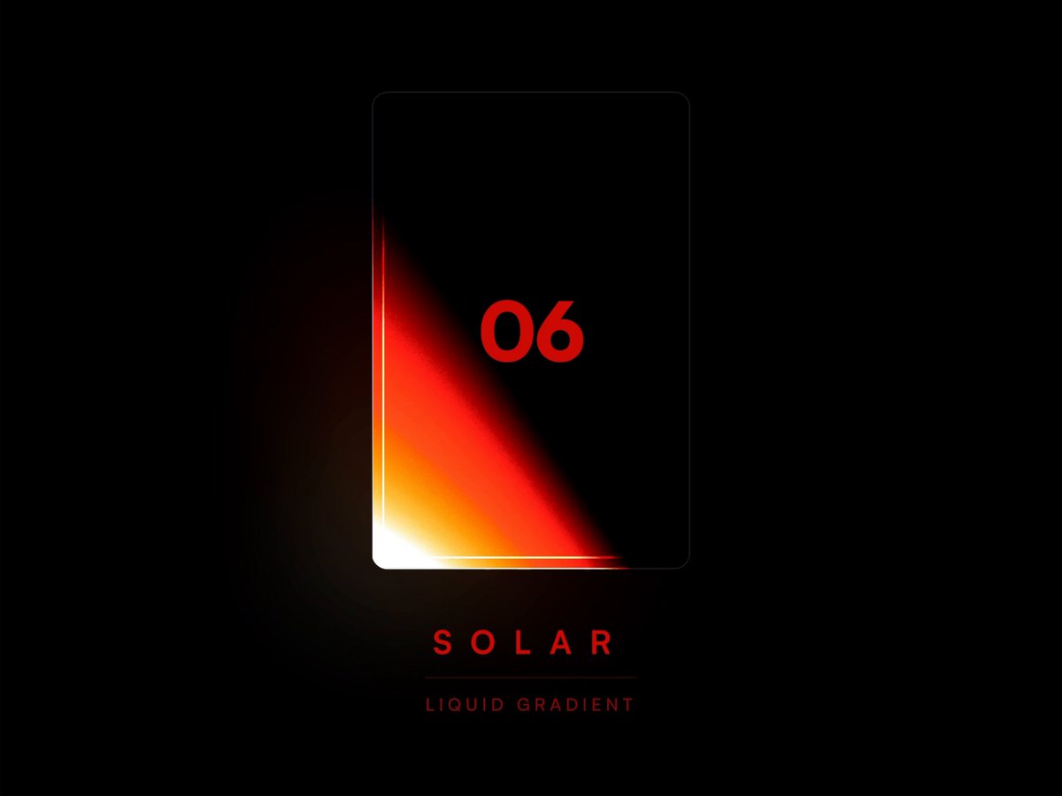 Pure heat. This one works well for anything that needs to feel intense and energetic — think sports, energy drinks, aggressive landing pages, or a bold hero section. The three black colors at the end of the palette are there to push the gradient deep into the dark, which gives that burning glow effect. Settings: 07 — Matcha Latte 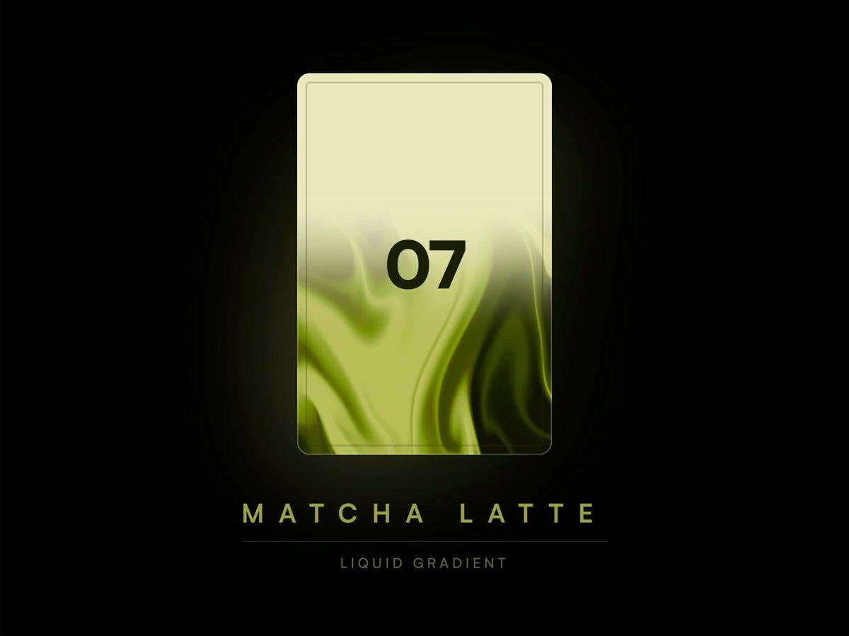 Looks exactly like someone pouring matcha into a glass with those swirls of green rising from the bottom. Very organic and natural feeling. Great for wellness brands, food products, anything in the health or lifestyle space. Also just a really satisfying animation to watch. Settings: 08 — Shelby 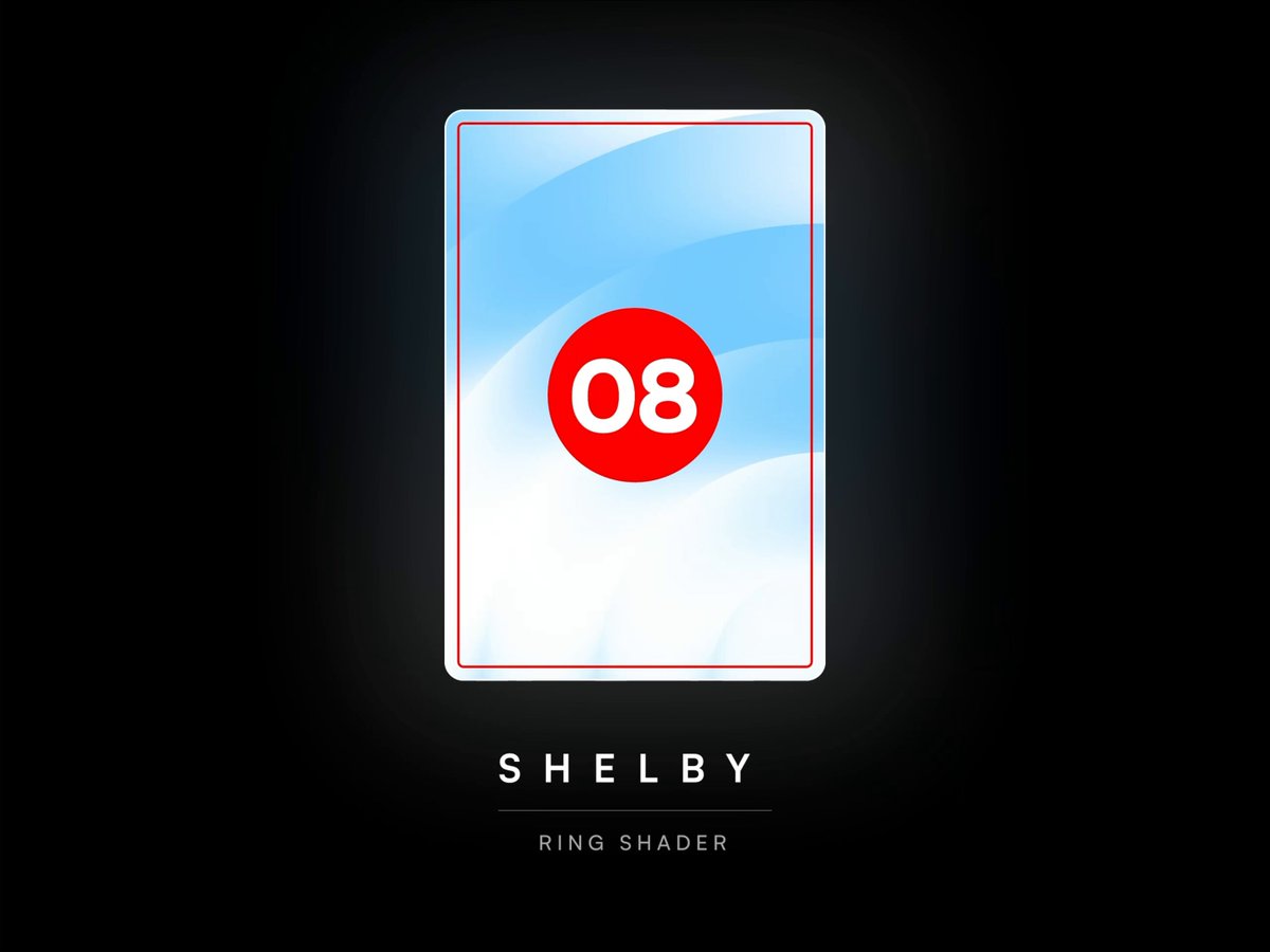 This one started as a cloudy sky. But then I started pushing the shape and speed, it turned into something completely different and more energetic. The moment I added the red accent, it clicked. Suddenly it got that Ford vs Ferrari racing energy. Settings: 09 — Obsidian 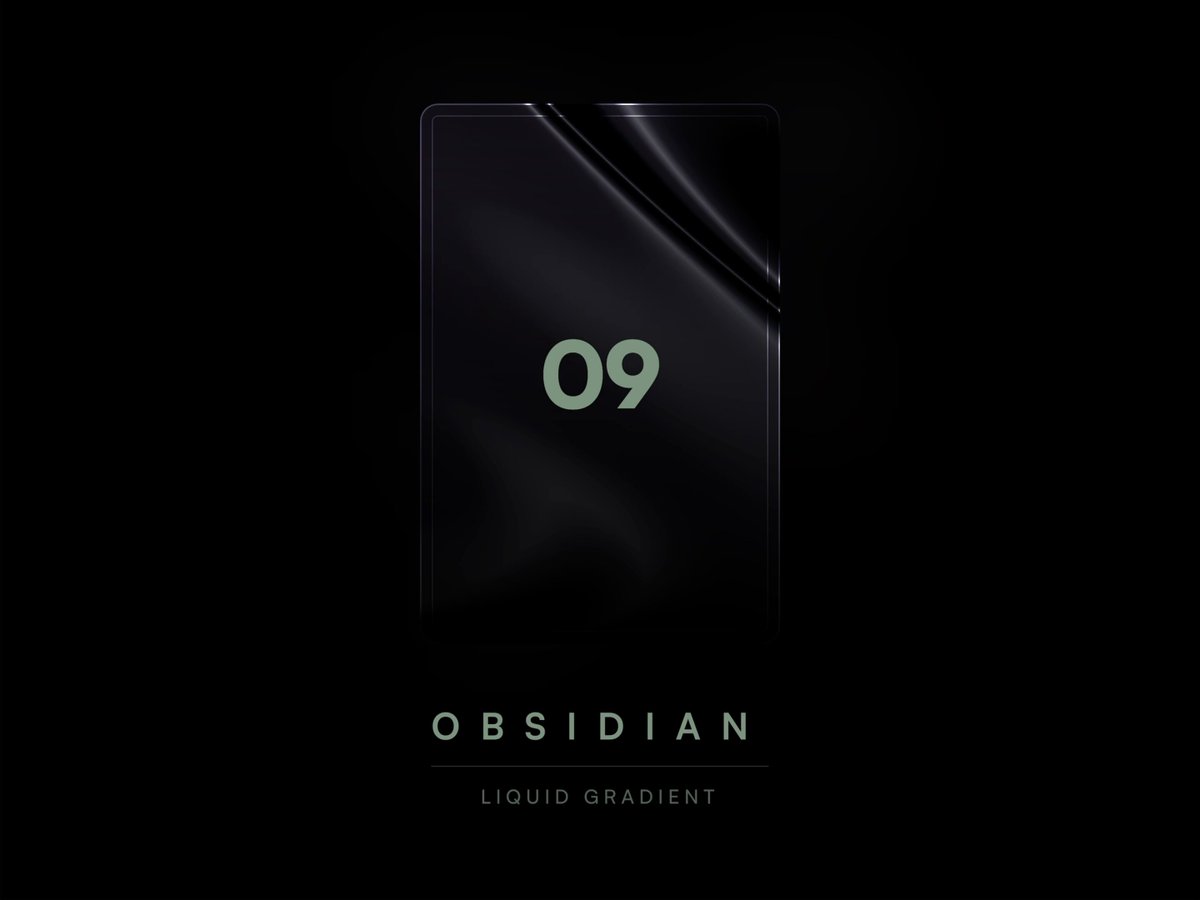 My take on the liquid metal aesthetic. Eight shades of near-black shifting against each other, with thin light streaks gliding across the surface. The result feels expensive in a very quiet way. Works great for luxury products, premium SaaS or even something cinematic. Settings: > 💡 Pro tip: Use tints. > Pure black and pure white rarely exist in nature. Adding a subtle color tint to your darks and lights makes everything feel more organic and visually rich. In this preset, none of the "blacks" are actually black — they all carry a slight blue or purple undertone, which is exactly what gives it that deep, premium feel. 10 — Dune 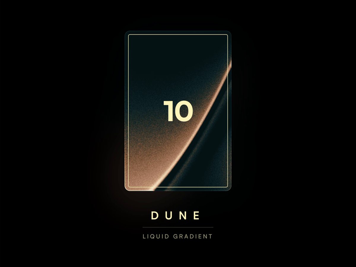 I really like how warm and calm this one turned out. The colors just feel good to look at and the whole thing moves without any rush. The grain noise adds a lot of texture and character. I think it would work great in branding projects. Settings: > 💡 Pro tip: Set Speed to 0. > I use shaders not just for animated effects but also to generate cool abstract visuals and backgrounds. Just set the speed to zero, randomize with seed, find a composition you like, and export it as an image. Thanks for exploring! This was a fun day. The best way to learn a new tool is to build something real with it, so that's exactly what I did with shaders. Spent a day going through them properly and sharing what came out of it with the community. I'll share a project link with all 10 presets soon. In the meantime, try recreating them manually, which is the fastest way to really understand how the tool works. Which one is your favorite? ## 相关链接 - [Nick Stepuk](https://x.com/stfnco) - [@stfnco](https://x.com/stfnco) - [20K](https://x.com/stfnco/status/2044768025786695971/analytics) - [@framer](https://x.com/@framer) - [Upgrade to Premium](https://x.com/i/premium_sign_up) - [9:21 PM · Apr 16, 2026](https://x.com/stfnco/status/2044768025786695971) - [20.7K Views](https://x.com/stfnco/status/2044768025786695971/analytics) - [View quotes](https://x.com/stfnco/status/2044768025786695971/quotes) --- *导出时间: 2026/4/17 15:12:01*
C Coding your color grade 文章介绍了 HyperFrames 平台新增的调色功能,提供专业的调色套件,包括色轮、RGB曲线、HSL选择、示波器和自定义LUT等。支持通过CLI命令或自然语言交互对视频和图像进行像素级调色处理,所见即所得,并详细说明了实现原理、代码集成方式及最佳实践。 技术 › 前端 ✍ HyperFrames🕐 2026-07-30 调色视频处理WebGLCLI媒体处理HyperFrames前端开发视觉效果
1 1分钟认识13类常见Motion动效名称 文章指出在交互和视频制作中,单纯向 AI Agent 描述动画效果往往效率低下且容易产生误解。为了解决这个问题,文章推荐了一个简短的视频教程,该视频整理并演示了 13 类常见的 Motion 动效名称(如 Push Slide, Staggered Entrance, FLIP 等)。掌握这些标准术语,可以帮助用户更准确地向 AI、设计师或开发者表达需求,大幅提升沟通效率。 技术 › 前端 ✍ meng shao🕐 2026-07-11 动效Motion交互设计AI Agent视频制作效率前端开发UX设计动画UI
有 有趣的交互式科学应用创意 Part 2 文章展示了作者开发的系列交互式科学应用 Demo,包括黑洞时空扭曲可视化、达芬奇扑翼机机制实现以及科幻彗星探测器等。作者结合了 GPT Images、Nano Banana 2 进行设计,并使用 Gemini 3.1 Pro 编写代码。文章还分享了设计灵感和前端控件交互示例,旨在打造儿时向往的科学杂志风格的互动体验。 技术 › 前端 ✍ Dilum Sanjaya🕐 2026-05-07 前端可视化AI编程设计灵感科学交互设计GeminiReactUI/UX开源
破 破屏穿越风格 AI 绘画分享 作者分享了一种极具视觉冲击力的“破屏穿越”风格 AI 绘图效果,人物仿佛从社交媒体界面中突破屏幕进入现实世界。文中详细解析了实现该效果的完整提示词,涵盖了人物姿势、社交媒体 UI 拟真、玻璃碎裂特效、电影级光影渲染以及 9:16 构图等技术要点。 技术 › LLM ✍ serein🕐 2026-05-06 AI绘画提示词视觉效果UI设计3D透视Stable DiffusionMidjourney设计灵感
让 让 Codex 成为 UI/UX 魔法师的设计循环指南 文章介绍了如何通过将 Codex 从命令行工具转变为视觉产品构建器。核心在于利用 Codex Desktop 的视觉反馈循环(构建、运行、截图、视觉审查、迭代),结合 Vision 审查和 ImageGen 资产生成,实现高效、精致的 UI/UX 设计。文中提供了游戏界面、产品 UI 及 A/B 测试的具体工作流和提示词。 技术 › Codex ✍ Meta Alchemist🕐 2026-05-04 UI/UX设计自动化工作流VisualA/B测试ImagegenVision前端开发提示词工程产品设计
T Top YC 公司着陆页的通用结构解析 文章分析了 5 家顶尖 YC 孵化公司(如 Resend, Deel 等)的着陆页设计,发现其结构惊人一致。核心模式包括:一行式标题配产品截图、首屏展示社会认同、单一的重复性 CTA、展示创始人照片以建立信任、公开透明的定价信息、精选 3-6 个核心功能,以及以行动号召结尾。这种结构符合用户“是什么-谁在用-怎么用-多少钱”的决策心理,能有效提升转化率。 技术 › 前端 ✍ clear🕐 2026-04-22 产品设计用户体验转化率着陆页创业SaaSUI/UX增长黑客前端开发营销
利 利用AI设计理想UI界面的实操工作流 本文介绍了利用 Claude、Gemini、Stitch 等 AI 工具打造符合审美要求的 UI 界面的实操 SOP。文章以开发一款类似灵动岛的提醒工具为例,详细演示了如何编写产品文档、生成设计提示词、利用 Stitch 生成界面以及导出代码。针对 Web 端难以还原 macOS 毛玻璃质感的问题,作者提出了一种“设计参考集 + Claude Code + SwiftUI”的更优解,直接通过 AI 实现高质量的前端还原。 技术 › 工具与效率 ✍ 冰河🕐 2026-04-08 AI设计UI/UXStitchClaudeClaude CodeGeminiWorkflowSwiftUI实操教程前端开发
用 用代码做视频:HyperFrames 和 Remotion 选型指南 文章对比了 HyperFrames 和 Remotion 两个代码生成视频框架。HyperFrames 基于 HTML/GSAP,零构建、AI 友好,适合从零构建的动画和 AI 自动化管线;Remotion 基于 React,支持视频导入叠加和批量渲染,适合在已有视频素材上合成。作者建议根据底层是否含视频、AI 参与度等场景按需选型。 技术 › 前端 ✍ 雪踏乌云🕐 2026-07-28 视频生成前端开发工具对比AI工作流RemotionHyperFrames
2 2026最强 AI 组合之一:Codex + Figma,不会代码也能做产品! 本文介绍了 Codex 与 Figma 结合的 AI 产品开发工作流。通过 Figma MCP 连接两者,实现了从需求梳理、设计生成到代码开发及浏览器验证的闭环。文章详细讲解了如何利用 Codex 进行需求分析和代码编写,以及如何在 Figma 中进行双向协作与设计评审,大幅降低了产品原型开发的门槛。 技术 › Codex ✍ 云析🕐 2026-07-28 AI产品开发FigmaCodexMCP前端开发设计工作流
如 如何用 Claude Code 做出能卖 1w 美元的网站 文章分享了使用 Claude Code 快速构建高端作品集网站的全过程。作者通过安装 Frontend Design 和 UI/UX Pro Max 技能,结合 Awwwards 参考图,利用精准的 Prompt 和交互式反馈,仅用 2 小时就完成了价值 5000 美元的设计,并详细介绍了动画实现、走查修复和最终打磨的方法。 技术 › Claude Code ✍ 老白(每日 AI 干货)🕐 2026-07-24 Claude Code网站开发前端设计UI/UX实战教程
手 手写代码的时代已经过去了:一次零基础的 vibe coding 全记录 作者记录了利用 Claude Code 和 AI 辅助工具,从零开始开发 AI 阅读插件 ReadCue 的全过程。文章探讨了 HTML 在 AI 时代的复兴、全新的设计开发范式,以及程序员如何从手写代码转向架构决策和产品定义。 技术 › Claude Code ✍ 独立开花卓富贵🕐 2026-07-23 AI编程Vibe Coding前端开发开发流程架构设计
3 30分钟把二次元老婆/老公搬上桌面!Codex 桌宠完整教程 本文介绍了如何利用一张 IP 设定图,在 Codex 中快速生成动态桌宠。文章详细讲解了从角色准备、生成包含多种状态和视角的动画图集,到最终打包安装的全流程,探讨了将 AI 工具个人化、使其成为工作伙伴的意义。 技术 › Codex ✍ Kimberly🕐 2026-07-21 Codex桌宠AI工具教程个性化IP设定动画Hatch PetAgent工作流