# 40 种适合杂志、海报与 AI 生图的英文字体图鉴(附提示词)——下册
**作者**: Adrian Punk
**日期**: 2026-09-03T10:16:19.000Z
**来源**: [https://x.com/AdrianPunk115/status/2095791816750596304](https://x.com/AdrianPunk115/status/2095791816750596304)
---
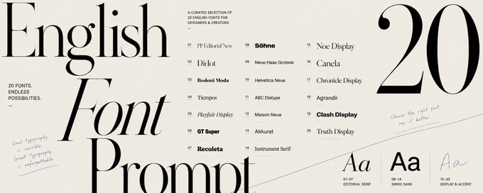
前 20 个解决“怎么让画面更像杂志”。
后 20 个解决另一个问题:怎么让字体更有性格。
极简、窄体、工业、手写、签名、马克笔,这一篇一次补齐。
> **Adrian Punk@AdrianPunk115**: [原文链接](https://x.com/AdrianPunk115/status/2095455845823971411)
>
# 21. Graphik
类型:中性无衬线 适合:媒体、科技、品牌、现代杂志
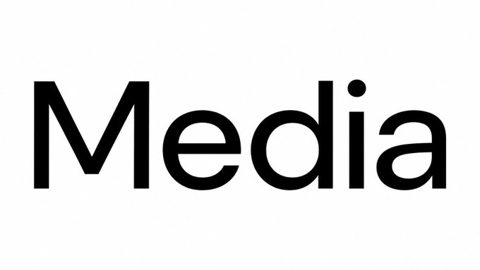
AI 生图提示词:
```
Graphik-inspired minimalist grotesque sans serif, neutral contemporary forms, clean editorial rhythm, modern brand typography
```
# 22. Circular
类型:几何无衬线 适合:互联网品牌、生活方式、产品
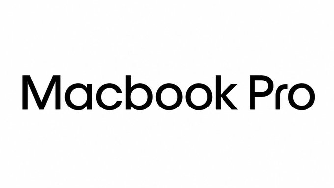
AI 生图提示词:
```
Circular-inspired geometric sans serif, friendly circular shapes, clean modern proportions, contemporary lifestyle brand typography
```
# 23. GT America
类型:怪诞无衬线 适合:商业、人物、文化、新闻型海报
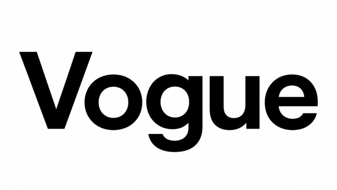
AI 生图提示词:
```
GT America-inspired grotesque sans serif, strong editorial proportions, contemporary American graphic design, confident headline typography
```
# 24. Founders Grotesk
类型:窄怪诞无衬线 适合:潮流、艺术、摄影、独立杂志
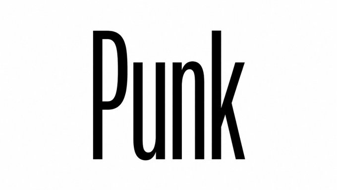
AI 生图提示词:
```
Founders Grotesk-inspired condensed grotesque sans serif, strong character, slightly irregular proportions, contemporary independent editorial typography
```
# 25. Neue Montreal
类型:现代怪诞无衬线 适合:设计工作室、建筑、艺术、品牌
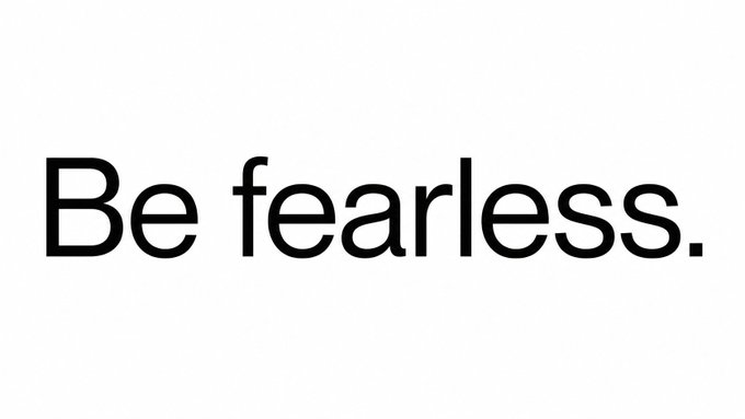
AI 生图提示词:
```
Neue Montreal-inspired modern grotesque sans serif, clean utilitarian forms, refined contemporary editorial design, understated personality
```
# 26. Suisse International
类型:瑞士怪诞无衬线 适合:品牌系统、科技、商业、极简设计
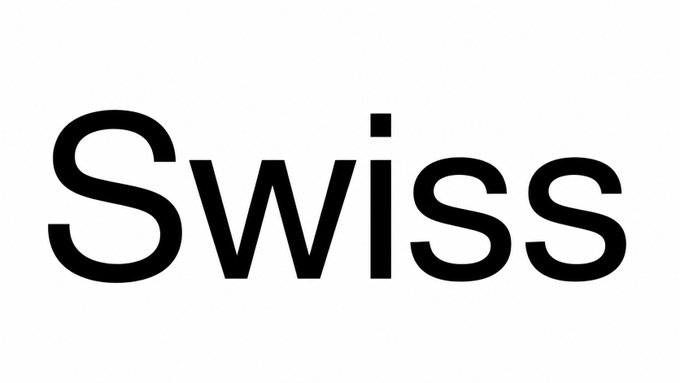
AI 生图提示词:
```
Suisse International-inspired Swiss grotesque sans serif, restrained neutral geometry, precise spacing, modernist editorial typography
```
# 27. Univers
类型:中性无衬线 适合:信息设计、科技、建筑、企业视觉

AI 生图提示词:
```
Univers-inspired rational neo-grotesque sans serif, systematic proportions, neutral modernist typography, precise information design
```
# 28. Akzidenz Grotesk
类型:经典怪诞无衬线 适合:现代主义、艺术展、独立海报
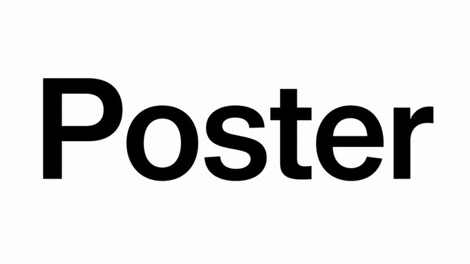
AI 生图提示词:
```
Akzidenz Grotesk-inspired classic grotesque sans serif, raw functional proportions, early Swiss modernist character, restrained poster typography
```
# 29. DIN Condensed
中文气质名:工业窄体
类型:工业无衬线 适合:运动、汽车、户外、机能海报
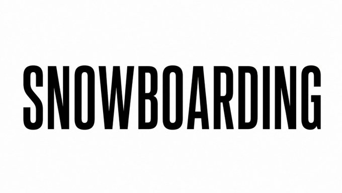
AI 生图提示词:
```
DIN Condensed-inspired industrial condensed sans serif, narrow technical letterforms, utilitarian geometry, strong poster typography
```
# 30. Bebas Neue
类型:窄体无衬线 适合:电影、运动、活动、强标题封面
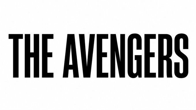
AI 生图提示词:
```
Bebas Neue-inspired tall condensed sans serif, bold uppercase lettering, narrow proportions, strong impactful poster typography
```
# 31. Franklin Gothic Condensed
类型:窄怪诞无衬线 适合:新闻、体育、复古美国、编辑标题
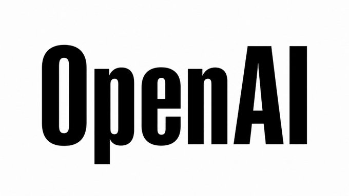
AI 生图提示词:
```
Franklin Gothic Condensed-inspired bold condensed grotesque, strong American editorial headline typography, compact confident letterforms
```
# 32. ITC Avant Garde Gothic
类型:几何无衬线 适合:音乐、时尚、复古未来、实验排版
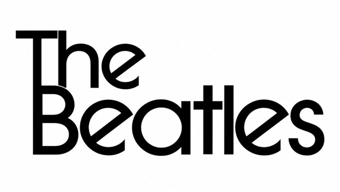
AI 生图提示词:
```
ITC Avant Garde Gothic-inspired geometric sans serif, dramatic circular forms, tight kerning, 1970s avant-garde typography
```
# 33. Biro Script
类型:真实手写 适合:笔记、签名、生活方式、旅行
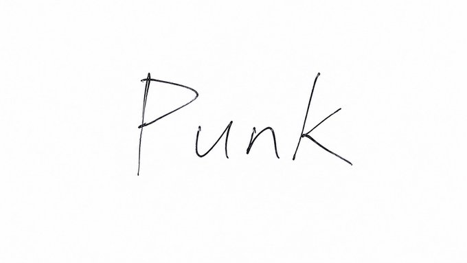
AI 生图提示词:
```
raw realistic ballpoint-pen handwriting, thin imperfect human strokes, slightly irregular baseline, natural spacing, casual editorial annotation, not formal calligraphy
```
# 34. Sacramento
类型:单线手写 适合:咖啡、旅行、音乐、女性生活方式
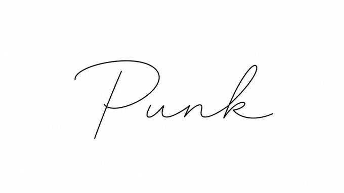
AI 生图提示词:
```
Sacramento-inspired minimal monoline handwritten script, relaxed vintage handwriting, thin continuous strokes, clean editorial elegance
```
# 35. Caveat
类型:自然手写 适合:批注、旅行、生活记录、创意海报
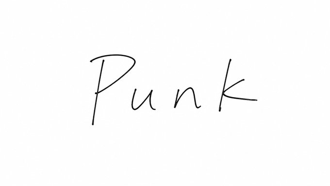
AI 生图提示词:
```
Caveat-inspired casual handwritten note, loose natural pen strokes, slightly messy human lettering, uneven baseline, authentic journal annotation
```
# 36. Allura
类型:书法手写 适合:时尚、珠宝、婚礼之外的精致点缀
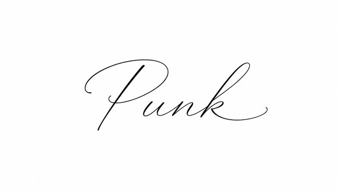
AI 生图提示词:
```
Allura-inspired elegant handwritten calligraphy, thin flowing strokes, graceful connected letters, refined editorial accent, restrained swashes
```
# 37. Permanent Marker
类型:马克笔手写 适合:PUNK、运动、街头、音乐、冲击型标题
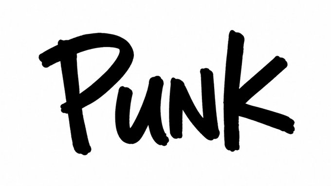
AI 生图提示词:
```
bold permanent-marker handwriting, thick irregular strokes, raw confident lettering, rough human edges, independent poster aesthetic
```
# 38. Rock Salt
类型:手绘字 适合:户外、滑板、音乐、手作、实验海报
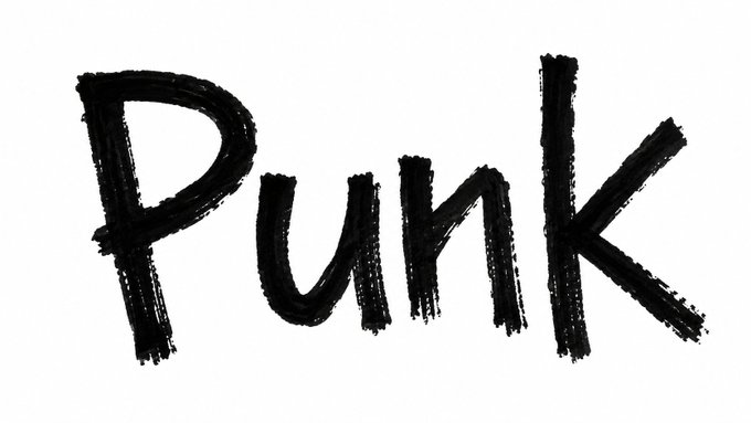
AI 生图提示词:
```
rough hand-drawn lettering, dry marker texture, irregular handmade strokes, raw experimental editorial typography
```
# 39. SignPainter
类型:笔刷手写 适合:复古广告、咖啡、汽车、音乐
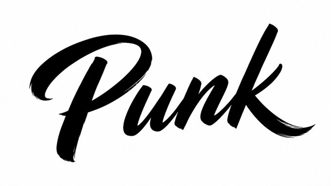
AI 生图提示词:
```
professional hand-painted sign lettering, fluid brush strokes, confident thick-and-thin contrast, vintage American commercial typography
```
# 40. Mrs Saint Delafield
类型:签名字体 适合:时尚、人物、摄影、生活方式
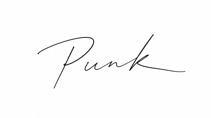
AI 生图提示词:
```
elegant fashion-editor signature handwriting, long fluid strokes, thin spontaneous pen lines, subtle irregularity, effortless luxury, minimal handwritten accent
```
# 怎么把 40 个字体真正用起来
不要在一张海报里堆很多字体。
对于大多数杂志和海报,我更建议只建立三层:
## 第一层:主标题
负责制造第一眼冲击。
可以用:
Didot / Bodoni / PP Editorial New / Canela / Futura / Bebas Neue
## 第二层:正文或信息层
负责让画面稳定、清楚。
可以用:
Helvetica Neue / Neue Haas Grotesk / Graphik / Suisse International / Avenir
## 第三层:手写点缀
负责制造“人味”和情绪。
可以用:
Biro Script / Caveat / Sacramento / SignPainter / Mrs Saint Delafield
我最常用的一组搭配逻辑是:
```
Main title:
large refined high-contrast editorial serif
Secondary information:
clean Swiss grotesque sans serif
Handwritten accent:
raw realistic ballpoint-pen handwriting
```
也就是:
高级衬线 + 极简无衬线 + 一点手写
这三个层级足够支撑绝大多数高级杂志视觉。
你可以把这作为一个英文字体库,给不同文字层级一个字体选择范围,
让你的海报直接随机组合字体。
# 直接可复制的完整 AI 海报字体提示词
```
Create a refined contemporary editorial poster based on the provided subject, photograph, and text.
INPUT
Subject: {{subject}}
Main headline: {{headline}}
Secondary text: {{secondary text}}
Handwritten accent: {{handwritten text}}
Aspect ratio: {{ratio}}
TYPOGRAPHY IS A PRIMARY VISUAL ELEMENT
Use only three clearly differentiated typographic layers.
1. MAIN HEADLINE — EDITORIAL SERIF
Use large, high-contrast editorial serif typography inspired by PP Editorial New, Didot, or Bodoni.
Characteristics:
elegant elongated letterforms,
very thin hairlines,
strong thick–thin contrast,
tall refined proportions,
fashion-editorial presence.
The headline should dominate the composition and may be:
oversized,
horizontal,
vertical,
diagonal,
split across multiple lines,
partially cropped by the canvas edge,
layered behind or in front of the subject,
or interwoven with the photographic composition.
Do not default to centered text.
2. SECONDARY INFORMATION — SWISS SANS SERIF
Use a clean neo-grotesque sans serif inspired by Neue Haas Grotesk or Helvetica Neue.
Characteristics:
small scale,
precise spacing,
neutral proportions,
high legibility,
restrained editorial layout.
Use secondary text sparingly as quiet structural information rather than decoration.
3. HANDWRITTEN ACCENT — REAL BALLPOINT PEN
Use raw, realistic ballpoint-pen handwriting.
Characteristics:
thin imperfect human strokes,
slightly irregular baseline,
natural spacing,
minor inconsistencies in letter shape,
casual spontaneous annotation,
personal and unpolished,
slightly messy but visually controlled.
It must look genuinely handwritten, not like a polished script font or formal calligraphy.
COMPOSITION
Treat typography and imagery as one integrated composition.
Typography may overlap, frame, interrupt, cross behind, or partially cover the main photographic subject when visually appropriate.
Vary text direction and scale deliberately.
Allow:
horizontal typography,
vertical typography,
diagonal typography,
oversized cropped letters,
small marginal notes,
asymmetrical placement,
unexpected negative-space positioning.
Maintain one dominant typographic gesture rather than filling every empty area.
Use generous negative space.
Keep the overall layout asymmetrical, confident, spacious, and editorially controlled.
VISUAL FEELING
premium independent magazine,
contemporary art book,
fashion editorial,
experimental typography,
quiet sophistication,
minimal but memorable,
art-directed rather than template-based.
AVOID
generic corporate typography,
wedding-style calligraphy,
decorative fantasy fonts,
fake handwritten fonts,
distorted or warped letters,
too many font families,
uniform centered layouts,
equal-sized text blocks,
dense information,
random decorative text,
unnecessary captions,
over-designed compositions.
FINAL PRINCIPLE
Use fewer elements, stronger hierarchy, and more intentional typography.
The result should feel designed by an editorial art director, not generated from a generic poster template.
```
# 最后给 40 个字体分成 8 种情绪
如果不想记 40 个名字,只记下面 8 种选择逻辑就够了:
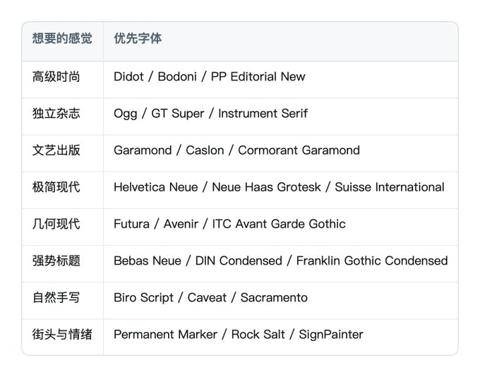
字体选得对,一张普通图片也会迅速出现编辑感。
## 关于作者
Punk|中科大管理学硕士|AI提示词、AI小白教程|Punk系列Skills作者|3个月赚了8位数|Learn in Public|FDE文章浏览量240w|[@AdrianPunk115](https://x.com/@AdrianPunk115)
## 相关链接
- [Adrian Punk](https://x.com/AdrianPunk115)
- [@AdrianPunk115](https://x.com/AdrianPunk115)
- [27K](https://x.com/AdrianPunk115/status/2095791816750596304/analytics)
- [Sep 3](https://x.com/AdrianPunk115/status/2095455845823971411)
- [43K](https://x.com/AdrianPunk115/status/2095455845823971411/analytics)
- [@AdrianPunk115](https://x.com/@AdrianPunk115)
- [Upgrade to Premium](https://x.com/i/premium_sign_up)
- [4:31 PM · Sep 4, 2026](https://x.com/AdrianPunk115/status/2095791816750596304)
- [27.1K Views](https://x.com/AdrianPunk115/status/2095791816750596304/analytics)
- [View quotes](https://x.com/AdrianPunk115/status/2095791816750596304/quotes)
---
*导出时间: 2026/9/5 19:45:36*